-
AI
- ML Intro
- ML and AI
- ML in JavaScript
- ML Examples
- ML Linear Graphs
- ML Scatter Plots
- ML Perceptrons
- ML Recognition
- ML Training
- ML Testing
- ML Learning
- ML Terminology
- ML Data
- ML Clustering
- ML Regressions
- ML Deep Learning
- ML Brain.js
- TFJS Tutorial
- TFJS Operations
- TFJS Models
- TFJS Visor
- Ex1 Intro
- Ex1 Data
- Ex1 Model
- Ex1 Training
- Ex2 Intro
- Ex2 Data
- Ex2 Model
- Ex2 Training
- Graph Intro
- Graph Canvas
- Graph Plotly.js
- Graph Chart.js
- Graph Google
- Graph D3.js
- History of Intelligence
- History of Languages
- History of Numbers
- History of Computing
- History of Robots
- History of AI
- Job Replacements
- Theory of Mind
- Mathematics
- Linear Functions
- Linear Algebra
- Vectors
- Matrices
- Tensors
- Statistics
- Descriptive
- Variability
- Distribution
- Probability
-
AngularJS
- AngularJS HOME
- AngularJS Intro
- AngularJS Expressions
- AngularJS Modules
- AngularJS Directives
- AngularJS Model
- AngularJS Data Binding
- AngularJS Controllers
- AngularJS Scopes
- AngularJS Filters
- AngularJS Services
- AngularJS Http
- AngularJS Tables
- AngularJS Select
- AngularJS SQL
- AngularJS DOM
- AngularJS Events
- AngularJS Forms
- AngularJS Validation
- AngularJS API
- AngularJS W3.CSS
- AngularJS Includes
- AngularJS Animations
- AngularJS Routing
- AngularJS Application
- AngularJS Examples
- AngularJS Reference
-
Arduino Projects
- How HC-SR04 Ultrasonic Sensor Works & Interface It With Arduino
- How HC-SR501 PIR Sensor Works & Interface It With Arduino
- Interfacing DHT11 and DHT22 Sensors with Arduino
- Interface DHT11 Module With Arduino
- Interfacing AM2320 Temperature & Humidity Sensor with Arduino
- Interfacing LM35 Temperature Sensor with Arduino
- How MQ2 Gas/Smoke Sensor Works? & Interface it with Arduino
- How MQ3 Alcohol Sensor Works? & Interface it with Arduino
- How RCWL-0516 Microwave Radar Motion Sensor Works & Interface It With Arduino
- Interfacing DS18B20 1-Wire Digital Temperature Sensor with Arduino
- Interfacing Multiple DS18B20 Digital Temperature Sensors with Arduino
- Interfacing MAX6675 Thermocouple Module with Arduino
- Interfacing SHT31 Temperature & Humidity Sensor with Arduino
- Interfacing HTU21D Temperature & Humidity Sensor with Arduino
- Interfacing Reed Switch with Arduino
- Interfacing Ball Tilt Switch Sensor with Arduino
- Interfacing Soil NPK Sensor with Arduino
- How Soil Moisture Sensor Works and Interface it with Arduino
- Interfacing Capacitive Soil Moisture Sensor with Arduino
- Interfacing MAX4466 Microphone Amplifier Module with Arduino
- Interface Sound Sensor with Arduino and Control Devices With a Clap
- How Water Level Sensor Works and Interface it with Arduino
- How Rain Sensor Works and Interface it with Arduino
- Interfacing Force Sensing Resistor (FSR) with Arduino
- Interfacing Flex Sensor with Arduino
- Monitor the Heart Rate using Pulse Sensor and Arduino
- Interfacing MAX30100 Pulse Oximeter and Heart Rate Sensor with Arduino
- Interfacing MAX30102 Pulse Oximeter and Heart Rate Sensor with Arduino
- Interface BMP180 Barometric Pressure & Temperature Sensor with Arduino
- Interface BME280 Temperature, Humidity & Pressure Sensor with Arduino
- Interface BME680 Environmental Sensor with Arduino
- Interfacing BMP388 Barometric Pressure Sensor (Altimeter) with Arduino
- Interfacing MS5611 Barometric Pressure Sensor with Arduino
- Interfacing TMP36 Temperature Sensor with Arduino
- Interface MLX90614 Non-contact Infrared Temperature Sensor with Arduino
- What is RFID? How It Works? Interface RC522 RFID Module with Arduino
- Interfacing TCS230/TCS3200 Color Sensor with Arduino
- How Accelerometer works? Interface ADXL335 with Arduino
- Interface MPU6050 Accelerometer and Gyroscope Sensor with Arduino
- Interfacing TFMini-S LiDAR Sensor with Arduino
- Interface DS1307 RTC Module with Arduino
- Interface DS3231 Precision RTC Module with Arduino
- Interface One Channel Relay Module with Arduino
- Interface Two Channel Relay Module with Arduino
- Interface 4×3 & 4×4 Membrane Keypad with Arduino
- How Rotary Encoder Works and Interface It with Arduino
- How 74HC595 Shift Register Works & Interface it with Arduino
- How 2-Axis Joystick Works & Interface with Arduino + Processing
-
ASP
- ASP HOME
- WebPages Intro
- WebPages Razor
- WebPages Layout
- WebPages Folders
- WebPages Global
- WebPages Forms
- WebPages Objects
- WebPages Files
- WebPages Databases
- WebPages Helpers
- WebPages WebGrid
- WebPages Charts
- WebPages Email
- WebPages Security
- WebPages Publish
- WebPages Examples
- WebPages Classes
- Razor Intro
- Razor Syntax
- Razor C# Variables
- Razor C# Loops
- Razor C# Logic
- Razor VB Variables
- Razor VB Loops
- Razor VB Logic
- ASP Intro
- ASP Syntax
- ASP Variables
- ASP Procedures
- ASP Conditionals
- ASP Looping
- ASP Forms
- ASP Cookies
- ASP Session
- ASP Application
- ASP #include
- ASP Global.asa
- ASP AJAX
- ASP e-mail
- ASP Examples
- ASP VB Functions
- ASP VB Keywords
- ASP Response
- ASP Request
- ASP Application
- ASP Session
- ASP Server
- ASP Error
- ASP FileSystem
- ASP TextStream
- ASP Drive
- ASP File
- ASP Folder
- ASP Dictionary
- ASP AdRotator
- ASP BrowserCap
- ASP Content Linking
- ASP Content Rotator
- ASP Quick Ref
- ADO Intro
- ADO Connect
- ADO Recordset
- ADO Display
- ADO Query
- ADO Sort
- ADO Add
- ADO Update
- ADO Delete
- ADO Command
- ADO Connection
- ADO Error
- ADO Field
- ADO Parameter
- ADO Property
- ADO Record
- ADO Recordset
- ADO Stream
- ADO DataTypes
-
AWS
- AWS HOME
- AWS Intro
- AWS Cloud Certification
- AWS Get Started
- AWS Cloud Computing
- AWS Cloud Benefits
- AWS EC2 Intro
- AWS EC2 Instance Types
- AWS EC2 Pricing
- AWS EC2 Scaling
- AWS EC2 Auto Scaling
- AWS Elastic Load Balancing
- AWS Messaging
- AWS SNS
- AWS SQS
- AWS Serverless
- AWS Lambda
- AWS Containers
- AWS ECS
- AWS EKS
- AWS Fargate
- AWS First Recap
- AWS Infrastructure
- AWS Regions
- AWS Availability Zones
- AWS Edge Locations
- AWS Provision
- AWS Provision Services
- AWS Elastic Beanstalk
- AWS CloudFormation
- AWS Second Recap
- AWS Networking
- AWS Connectivity
- AWS Subnet and Access
- AWS Global Networking
- AWS Third Recap
- AWS Storage and DBs
- AWS Instance Stores
- AWS EBS
- AWS S3
- AWS EBS vs S3
- AWS Elastic File System
- AWS RDS
- AWS DynamoDB
- AWS DynamoDB vs RDS
- AWS Redshift
- AWS DMS
- AWS Additional DB Services
- AWS Fourth Recap
- AWS Cloud Security
- AWS Shared Responsibility
- AWS User Access
- AWS Organizations
- AWS Cloud Compliance
- AWS DDoS
- AWS Other Services
- AWS Fifth Recap
- AWS Monitoring and Analytics
- AWS CloudWatch
- AWS CloudTrail
- AWS TrustedAdvisor
- AWS Sixth Recap
- AWS Pricing and Support
- AWS Free Tier
- AWS Pricing Models
- AWS Billing Dashboard
- AWS Consolidated Billing
- AWS Budgets
- AWS Cost Explorer
- AWS Support Plans
- AWS Marketplace
- AWS Seventh Recap
- AWS Migration and Innovation
- AWS Cloud Adoption Framework
- AWS Migration Strategies
- AWS Snow Family
- AWS Innovation
- AWS Eight Recap
- AWS Cloud Journey
- AWS Well-Architected Framework
- AWS Cloud Benefits
- AWS Ninth Recap
- AWS Exam Preparation
- AWS Cloud Exercises
- AWS Cloud Quiz
- Python Apps on AWS
- DevOps on AWS
- AWS Machine Learning
- AWS Serverless
- Basic Electronics
-
C
- C HOME
- C Intro
- C Get Started
- C Syntax
- C Output
- Print Text
- New Lines
- C Comments
- C Variables
- C Data Types
- Data Types
- Type Conversion
- C Constants
- C Operators
- C Booleans
- C If...Else
- C If...Else
- C Short Hand If
- C Switch
- C While Loop
- C For Loop
- C Break/Continue
- C Arrays
- Arrays
- Multidimensional Arrays
- C Strings
- Strings
- Special Characters
- String Functions
- C User Input
- C Memory Address
- C Pointers
- Pointers
- Pointers & Arrays
- C Functions
- C Function Parameters
- C Function Declaration
- C Recursion
- C Math Functions
- C Create Files
- C Write To Files
- C Read Files
- C Structures
- C Enums
- C Examples
- C Exercises
- C Quiz
- C Compiler
-
C#
- C# HOME
- C# Intro
- C# Get Started
- C# Syntax
- C# Output
- C# Comments
- C# Variables
- Variables
- Constants
- Display Variables
- Multiple Variables
- Identifiers
- C# Data Types
- C# Type Casting
- C# User Input
- C# Operators
- Arithmetic
- Assignment
- Comparison
- Logical
- C# Math
- C# Strings
- Strings
- Concatenation
- Interpolation
- Access Strings
- Special Characters
- C# Booleans
- C# If...Else
- if
- else
- else if
- Short hand if..else
- C# Switch
- C# While Loop
- C# For Loop
- For loop
- Foreach loop
- C# Break/Continue
- C# Arrays
- Arrays
- Loop through an array
- Sort arrays
- Multidimensional arrays
- C# Methods
- C# Method Parameters
- Parameters & Arguments
- Default Parameter
- Return Values
- Named Arguments
- C# Method Overloading
- C# OOP
- C# Classes/Objects
- Classes and Objects
- Multiple Objects
- C# Class Members
- C# Constructors
- C# Access Modifiers
- C# Properties
- C# Inheritance
- C# Polymorphism
- C# Abstraction
- C# Interface
- Interface
- Multiple Interfaces
- C# Enums
- C# Files
- C# Exceptions
- Add Two Numbers
- C# Examples
- C# Compiler
- C# Exercises
- C# Quiz
- C# Certificate
-
C++
- C++ HOME
- C++ Intro
- C++ Get Started
- C++ Syntax
- C++ Output
- Print Text
- New Lines
- C++ Comments
- C++ Variables
- Declare Variables
- Declare Multiple Variables
- Identifiers
- Constants
- C++ User Input
- C++ Data Types
- Basic Data Types
- Numbers
- Booleans
- Characters
- Strings
- C++ Operators
- Arithmetic
- Assignment
- Comparison
- Logical
- C++ Strings
- Strings
- Concatenation
- Numbers and Strings
- String Length
- Access Strings
- Special Characters
- User Input Strings
- Omitting Namespace
- C++ Math
- C++ Booleans
- Boolean Values
- Boolean Expressions
- C++ Conditions
- if
- else
- else if
- Short hand if..else
- C++ Switch
- C++ While Loop
- While Loop
- Do/While Loop
- C++ For Loop
- C++ Break/Continue
- C++ Arrays
- Arrays
- Arrays and Loops
- Omit Array Size
- Get Array Size
- Multidimensional Arrays
- C++ Structures
- C++ References
- Create References
- Memory Address
- C++ Pointers
- Create Pointers
- Dereferencing
- Modify Pointers
- C++ Functions
- C++ Function Parameters
- Parameters/Arguments
- Default Parameter
- Multiple Parameters
- Return Values
- Pass By Reference
- Pass Arrays
- C++ Function Overloading
- C++ Recursion
- C++ OOP
- C++ Classes/Objects
- C++ Class Methods
- C++ Constructors
- C++ Access Specifiers
- C++ Encapsulation
- C++ Inheritance
- Inheritance
- Multilevel Inheritance
- Multiple Inheritance
- Access Specifiers
- C++ Polymorphism
- C++ Files
- C++ Exceptions
- Add Two Numbers
- C++ Examples
- C++ Compiler
- C++ Exercises
- C++ Quiz
- C++ Certificate
-
CSS
- CSS HOME
- CSS Introduction
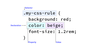
- CSS Syntax
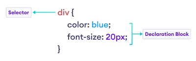
- CSS Selectors
- CSS How To
- CSS Comments
- CSS Colors
- Colors
- RGB
- HEX
- HSL
- CSS Backgrounds
- Background Color
- Background Image
- Background Repeat
- Background Attachment
- Background Shorthand
- CSS Borders
- Borders
- Border Width
- Border Color
- Border Sides
- Border Shorthand
- Rounded Borders
- CSS Margins
- Margins
- Margin Collapse
- CSS Padding
- CSS Height/Width
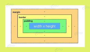
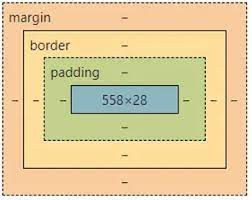
- CSS Box Model
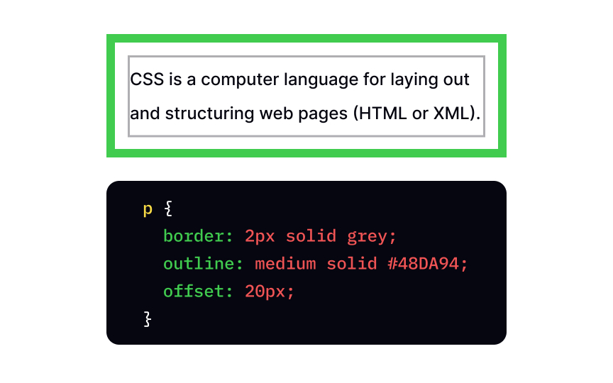
- CSS Outline
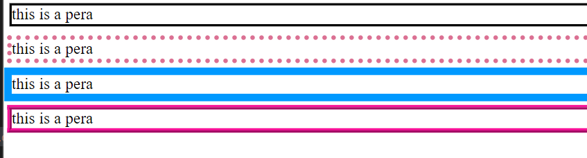
- Outline
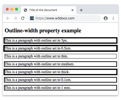
- Outline Width
- Outline Color
- Outline Shorthand
- Outline Offset
- CSS Text
- Text Color
- Text Alignment
- Text Decoration
- Text Transformation
- Text Spacing
- Text Shadow
- CSS Fonts
- Font Family
- Font Web Safe
- Font Fallbacks
- Font Style
- Font Size
- Font Google
- Font Pairings
- Font Shorthand
- CSS Icons
- CSS Links
- CSS Lists
- CSS Tables
- Table Borders
- Table Size
- Table Alignment
- Table Style
- Table Responsive
- CSS Display
- CSS Max-width
- CSS Position
- CSS Z-index
- CSS Overflow
- CSS Float
- Float
- Clear
- Float Examples
- CSS Inline-block
- CSS Align
- CSS Combinators
- CSS Pseudo-class
- CSS Pseudo-element
- CSS Opacity
- CSS Navigation Bar
- Navbar
- Vertical Navbar
- Horizontal Navbar
- CSS Dropdowns
- CSS Image Gallery
- CSS Image Sprites
- CSS Attr Selectors
- CSS Forms
- CSS Counters
- CSS Website Layout
- CSS Units
- CSS Specificity
- CSS !important
- CSS Math Functions
- CSS Rounded Corners
- CSS Border Images
- CSS Backgrounds
- CSS Colors
- CSS Color Keywords
- CSS Gradients
- Linear Gradients
- Radial Gradients
- Conic Gradients
- CSS Shadows
- Shadow Effects
- Box Shadow
- CSS Text Effects
- CSS Web Fonts
- CSS 2D Transforms
- CSS 3D Transforms
- CSS Transitions
- CSS Animations
- CSS Tooltips
- CSS Style Images
- CSS Image Reflection
- CSS object-fit
- CSS object-position
- CSS Masking
- CSS Buttons
- CSS Pagination
- CSS Multiple Columns
- CSS User Interface
- CSS Variables
- The var() Function
- Overriding Variables
- Variables and JavaScript
- Variables in Media Queries
- CSS Box Sizing
- CSS Media Queries
- CSS MQ Examples
- CSS Flexbox
- CSS Flexbox
- CSS Flex Container
- CSS Flex Items
- CSS Flex Responsive
- RWD Intro
- RWD Viewport
- RWD Grid View
- RWD Media Queries
- RWD Images
- RWD Videos
- RWD Frameworks
- RWD Templates
- Grid Intro
- Grid Container
- Grid Item
- SASS Tutorial
- CSS Templates
- CSS Examples
- CSS Editor
- CSS Snippets
- CSS Quiz
- CSS Exercises
- CSS Bootcamp
- CSS Certificate
- CSS Reference
- CSS Selectors
- CSS Functions
- CSS Reference Aural
- CSS Web Safe Fonts
- CSS Animatable
- CSS Units
- CSS PX-EM Converter
- CSS Colors
- CSS Color Values
- CSS Default Values
- CSS Browser Support
-
Cyber Security
- CS HOME
- CS Cyber Crime
- CS Money Making Threats
- CS Dark Web
- CS Networking Basics
- CS Network Layer
- CS Network Transport
- CS Firewalls
- CS Web Applications
- CS Mapping &Port Scanning
- CS Network Attacks
- CS Web Application Attacks
- CS WIFI Attacks
- CS Penetration Testing &Social Engineering
- CS Passwords
- CS Security Operations
- CS Incident Response
- CS Quiz
- CS Certificate
-
Data Science
- DS HOME
- DS Introduction
- DS What is Data
- DS Database Table
- DS Python
- DS DataFrame
- DS Functions
- DS Data Preparation
- DS Linear Functions
- DS Plotting Functions
- DS Slope and Intercept
- Stat Introduction
- Stat Percentiles
- Stat Standard Deviation
- Stat Variance
- Stat Correlation
- Stat Correlation Matrix
- Stat Correlation vs Causality
- DS Linear Regression
- DS Regression Table
- DS Regression Info
- DS Regression Coefficients
- DS Regression P-Value
- DS Regression R-Squared
- DS Linear Regression Case
- DS Bootcamp
- DBaaS
- DBReplication
-
Django
- Django Home
- Django Intro
- Django Get Started
- Create Virtual Environment
- Install Django
- Django Create Project
- Django Create App
- Django Views
- Django URLs
- Django Templates
- Django Models
- Django Insert Data
- Django Update Data
- Django Delete Data
- Django Update Model
- Prepare Template and View
- Add Link to Details
- Add Master Template
- Add Main Index Page
- Django 404 Template
- Add Test View
- Django Admin
- Create User
- Include Models
- Set List Display
- Update Members
- Add Members
- Delete Members
- Django Variables
- Django Tags
- Django If Else
- Django For Loop
- Django Comment
- Django Include
- QuerySet Introduction
- QuerySet Get
- QuerySet Filter
- QuerySet Order By
- Add Static Files
- Install WhiteNoise
- Collect Static Files
- Add Global Static Files
- Add Styles to the Project
- PostgreSQL Intro
- Create AWS Account
- Create Database in RDS
- Connect to Database
- Add Members
- Elastic Beanstalk (EB)
- Create requirements.txt
- Create django.config
- Create .zip File
- Deploy with EB
- Update Project
- Add Slug Field
- Add Bootstrap 5
- Template Tag Reference
- Filter Reference
- Field lookups Reference
- Django Compiler
- Django Exercises
- Django Quiz
- Django Certificate
- Add Main Index Page
- Django Template Variables
- Filter Reference
- Django Variables
- Django Variables
- Django Tags
- Django For Loop
- QuerySet Introduction
- Add Static Files
- DS Database Table
-
ESP32 Projects
- Getting Started with ESP32
- ESP32 vs. ESP8266: Which Microcontroller Is Right for You?
- ESP32 Pinout Reference
- ESP32-WROOM-32 Pinout Reference
- ESP32 Basics: Analog-to-digital Converter (ADC)
- ESP32 Basics: Hall Effect Sensor
- ESP32 Basics: Capacitive Touch Pins
- ESP32 Basics: Generating a PWM Signal on the ESP32
- Configuring & Handling ESP32 GPIO Interrupts In Arduino IDE
- Insight Into ESP32 Sleep Modes & Their Power Consumption
- ESP32 Deep Sleep & Its Wake-up Sources
- Create A Simple ESP32 Web Server In Arduino IDE
- How to Create an ESP32 Web Server with WebSockets in Arduino IDE
- ESP32 Basics: Bluetooth Classic
- ESP32 Basics: Bluetooth Low Energy (BLE)
- How to Build a CAN Bus With ESP32
- Create A Simple ESP32 Web Server In Arduino IDE
- Interface DHT11 DHT22 with ESP32 & Display Values Using Web Server
- Create A Simple ESP32 Weather Station With BME280
- Interface Multiple DS18B20s with ESP32 & Display Values Using Web Server
- Getting Started With ESP32-CAM
- ESP32-CAM Pinout Reference
- Control WS2812B Addressable LEDs with ESP32 and WLED
- Getting started with Sound Reactive WLED
- How to Find and Change the MAC Address on ESP32
- How to Solve “A Fatal Error Occurred: Failed to Connect to ESP32: Timed Out Waiting for Packet Headerâ€
- How to set up mDNS on an ESP32
- How to set a Static or Fixed IP Address on your ESP32
- ESP32 Basic Over The Air (OTA) Programming In Arduino IDE
- ESP32 Web Updater Over The Air (OTA) Programming In Arduino IDE
- Getting Date & Time From NTP Server With ESP32
- Interface OLED Graphic Display Module with ESP32
-
ESP8266 Projects
- Getting Started with ESP8266
- Installing ESP8266 Board in the Arduino IDE
- ESP8266 Pinout Reference
- Create A Simple ESP8266 NodeMCU Web Server In Arduino IDE
- Configuring & Handling ESP8266 GPIO Interrupts In Arduino IDE
- ESP8266 Over The Air (OTA) Programming In Arduino IDE
- Getting Date & Time From NTP Server With ESP8266 NodeMCU
- Control WS2812B Addressable LEDs with ESP8266 and WLED
- Interface DHT11 DHT22 w/ ESP8266 NodeMCU Using Web Server
- How to Use an I2C LCD Display With ESP8266
- Interface OLED Graphic Display Module with ESP8266 NodeMCU
- Display Values of Multiple DS18B20s on ESP8266 NodeMCU Web Server
- Create A Simple ESP8266 Weather Station With BME280
-
Excel
- Excel HOME
- Excel Introduction
- Excel Get Started
- Excel Overview
- Excel Syntax
- Excel Ranges
- Excel Fill
- Filling
- Double Click to Fill
- Excel Move Cells
- Excel Add Cells
- Excel Delete Cells
- Excel Undo Redo
- Excel Formulas
- Excel Relative Reference
- Excel Absolute Reference
- Excel Arithmetic Operators
- Excel Addition
- Excel Subtraction
- Excel Multiplication
- Excel Division
- Excel Parentheses
- Excel Functions
- Excel Formatting
- Excel Format Painter
- Excel Format Colors
- Excel Format Fonts
- Excel Format Borders
- Excel Format Numbers
- Excel Format Grids
- Excel Format Settings
- Excel Sort
- Excel Filter
- Excel Tables
- Tables
- Table Design
- Table Resizing
- Remove Duplicates
- Convert Table to Range
- Table Style
- Excel Conditional Format
- Excel Highlight Cell Rules
- Highlight Cell Rules
- HCR - Greater Than
- HCR - Less Than
- HCR - Between
- HCR - Equal To
- HCR - Text That Contains
- HCR - Date Occurring
- HCR - Unique Values
- Excel Top Bottom Rules
- Top Bottom Rules
- Above Below Average
- Excel Data Bars
- Excel Color Scales
- Excel Icon Sets
- Excel Manage Rules (CF)
- Excel Charts
- Charts
- Bar Charts
- Stacked Bar Charts
- Column Charts
- Stacked Column Charts
- Pie Charts
- Line Charts
- Stacked Line Charts
- 100% Stacked Line Charts
- Radar Charts
- Excel Charts Customization
- Table Pivot Intro
- Case: Poke Mart
- Case: Poke Mart, Styling
- AND
- AVERAGE
- AVERAGEIF
- AVERAGEIFS
- CONCAT
- COUNT
- COUNTA
- COUNTBLANK
- COUNTIF
- COUNTIFS
- IF
- IFS
- LEFT
- LOWER
- MAX
- MEDIAN
- MIN
- MODE
- NPV
- OR
- RAND
- RIGHT
- STDEV.P
- STDEV.S
- SUM
- SUMIF
- SUMIFS
- TRIM
- VLOOKUP
- XOR
- Convert Time to Seconds
- Difference Between Times
- NPV (Net Present Value)
- Remove Duplicates
- Introduction to Excel
- Learn Data Calculations
- Learn Data Visualization
- Learn to Create a Budget
- Learn to Create a Timeline
- Learn to Style in Excel
- Excel Exercises
- Excel Certificate
- Excel Keyboard Shortcuts
- Excel HOME
- Excel HOME
- Excel Get Started
-
GIT
- Git HOME
- Git Intro
- Git Get Started
- Git New Files
- Git Staging Environment
- Git Commit
- Git Help
- Git Branch
- Git Branch Merge
- {{title}} Get Started
- {{title}} Edit Code
- Pull from {{title}}
- Push to {{title}}
- {{title}} Branch
- Pull Branch from {{title}}
- Push Branch to {{title}}
- GitHub Flow
- {{title}} Pages
- {{title}} Fork
- Git Clone from {{title}}
- {{title}} Send Pull Request
- Git .gitignore
- Git Security SSH
- {{title}} Add SSH
- Git Revert
- Git Reset
- Git Amend
- Git Exercises
- Git Quiz
- Git Help
-
GO
- Go Home
- Go Introduction
- Go Get Started
- Go Syntax
- Go Comments
- Go Variables
- Declare Variables
- Declare Multiple Variables
- Naming Rules
- Go Constants
- Go Output
- Output Functions
- Formatting Verbs
- Go Data Types
- Basic Data Types
- Boolean
- Integer
- Float
- String
- Go Arrays
- Go Slices
- Create Slice
- Modify Slice
- Go Operators
- Operators
- Arithmetic
- Assignment
- Comparison
- Logical
- Bitwise
- Go Conditions
- Conditions
- if Statement
- if else Statement
- else if Statement
- Nested if
- Go Switch
- Single-case
- Multi-case
- Go Loops
- Go Functions
- Create/Call Function
- Parameters/Arguments
- Function Returns
- Recursion
- Go Struct
- Go Maps
- Go Exercises
- Go Compiler
-
HTML
- HTML HOME
- HTML Introduction
- HTML Editors
- HTML Basic
- HTML Elements
- HTML Attributes
- HTML Headings
- HTML Paragraphs
- HTML Styles
- HTML Formatting
- HTML Quotations
- HTML Comments
- HTML Colors
- Colors
- RGB
- HEX
- HSL
- HTML CSS
- HTML Links
- Links
- Link Colors
- Link Bookmarks
- HTML Images
- Images
- Image Map
- Background Images
- The Picture Element
- HTML Favicon
- HTML Page Title
- HTML Tables
- HTML Tables
- Table Borders
- Table Sizes
- Table Headers
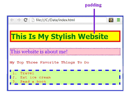
- Padding & Spacing
- Colspan & Rowspan
- Table Styling
- Table Colgroup
- HTML Lists
- Lists
- Unordered Lists
- Ordered Lists
- Other Lists
- HTML Block & Inline
- HTML Classes
- HTML Id
- HTML Iframes
- HTML JavaScript
- HTML File Paths
- HTML Head
- HTML Layout
- HTML Responsive
- HTML Computercode
- HTML Semantics
- HTML Style Guide
- HTML Entities
- HTML Symbols
- HTML Emojis
- HTML Charset
- HTML URL Encode
- HTML vs. XHTML
- HTML Forms
- HTML Form Attributes
- HTML Form Elements
- HTML Input Types
- HTML Input Attributes
- HTML Input Form Attributes
- HTML Canvas
- HTML SVG
- HTML Media
- HTML Video
- HTML Audio
- HTML Plug-ins
- HTML YouTube
- HTML Geolocation
- HTML Drag/Drop
- HTML Web Storage
- HTML Web Workers
- HTML SSE
- HTML Examples
- HTML Editor
- HTML Quiz
- HTML Exercises
- HTML Bootcamp
- HTML Certificate
- HTML Summary
- HTML Accessibility
- HTML Tag List
- HTML Attributes
- HTML Global Attributes
- HTML Browser Support
- HTML Events
- HTML Colors
- HTML Canvas
- HTML Audio/Video
- HTML Doctypes
- HTML Character Sets
- HTML URL Encode
- HTML Lang Codes
- HTTP Messages
- HTTP Methods
- PX to EM Converter
- Keyboard Shortcuts
-
Java
- Java HOME
- Java Intro
- Java Get Started
- Java Syntax
- Java Output
- Print Text
- Print Numbers
- Java Comments
- Java Variables
- Variables
- Print Variables
- Declare Multiple Variables
- Identifiers
- Java Data Types
- Data Types
- Numbers
- Booleans
- Characters
- Non-primitive Types
- Java Type Casting
- Java Operators
- Java Strings
- Strings
- Concatenation
- Numbers and Strings
- Special Characters
- Java Math
- Java Booleans
- Java If...Else
- If...Else
- Short Hand If...Else
- Java Switch
- Java While Loop
- Java For Loop
- For Loop
- For-Each Loop
- Java Break/Continue
- Java Arrays
- Arrays
- Loop Through an Array
- Multidimensional Arrays
- Java Methods
- Java Method Parameters
- Java Method Overloading
- Java Scope
- Java Recursion
- Java OOP
- Java Classes/Objects
- Java Class Attributes
- Java Class Methods
- Java Constructors
- Java Modifiers
- Java Encapsulation
- Java Packages / API
- Java Inheritance
- Java Polymorphism
- Java Inner Classes
- Java Abstraction
- Java Interface
- Java Enums
- Java User Input
- Java Date
- Java ArrayList
- Java LinkedList
- Java HashMap
- Java HashSet
- Java Iterator
- Java Wrapper Classes
- Java Exceptions
- Java RegEx
- Java Threads
- Java Lambda
- Java Files
- Java Create/Write Files
- Java Read Files
- Java Delete Files
- Add Two Numbers
- Count Words
- Reverse a String
- Sum of Array Elements
- Area of Rectangle
- Even or Odd Number
- Java Keywords
- abstract
- boolean
- break
- byte
- case
- catch
- char
- class
- continue
- default
- do
- double
- else
- enum
- extends
- final
- finally
- float
- for
- if
- implements
- import
- instanceof
- int
- interface
- long
- new
- package
- private
- protected
- public
- return
- short
- static
- super
- switch
- this
- throw
- throws
- try
- void
- while
- Java String Methods
- Java Math Methods
- Java Examples
- Java Compiler
- Java Exercises
- Java Quiz
- Java Certificate
- Java Operators
-
JavaScript
- JS HOME
- JS Introduction
- JS Where To
- JS Output
- JS Statements
- JS Syntax
- JS Comments
- JS Variables
- JS Let
- JS Const
- JS Operators
- JS Arithmetic
- JS Assignment
- JS Data Types
- JS Functions
- JS Objects
- JS Events
- JS Strings
- JS String Methods
- JS String Search
- JS String Templates
- JS Numbers
- JS BigInt
- JS Number Methods
- JS Number Properties
- JS Arrays
- JS Array Methods
- JS Array Sort
- JS Array Iteration
- JS Array Const
- JS Dates
- JS Date Formats
- JS Date Get Methods
- JS Date Set Methods
- JS Math
- JS Random
- JS Booleans
- JS Comparisons
- JS If Else
- JS Switch
- JS Loop For
- JS Loop For In
- JS Loop For Of
- JS Loop While
- JS Break
- JS Iterables
- JS Sets
- JS Maps
- JS Typeof
- JS Type Conversion
- JS Bitwise
- JS RegExp
- JS Precedence
- JS Errors
- JS Scope
- JS Hoisting
- JS Strict Mode
- JS this Keyword
- JS Arrow Function
- JS Classes
- JS Modules
- JS JSON
- JS Debugging
- JS Style Guide
- JS Best Practices
- JS Mistakes
- JS Performance
- JS Reserved Words
- JS Versions
- JS 2009 (ES5)
- JS 2015 (ES6)
- JS 2016
- JS 2017
- JS 2018
- JS 2019
- JS 2020
- JS 2021/2022
- JS IE / Edge
- JS History
- Object Definitions
- Object Properties
- Object Methods
- Object Display
- Object Accessors
- Object Constructors
- Object Prototypes
- Object Iterables
- Object Sets
- Object Maps
- Object Reference
- Function Definitions
- Function Parameters
- Function Invocation
- Function Call
- Function Apply
- Function Bind
- Function Closures
- Class Intro
- Class Inheritance
- Class Static
- JS Callbacks
- JS Asynchronous
- JS Promises
- JS Async/Await
- DOM Intro
- DOM Methods
- DOM Document
- DOM Elements
- DOM HTML
- DOM Forms
- DOM CSS
- DOM Animations
- DOM Events
- DOM Event Listener
- DOM Navigation
- DOM Nodes
- DOM Collections
- DOM Node Lists
- JS Window
- JS Screen
- JS Location
- JS History
- JS Navigator
- JS Popup Alert
- JS Timing
- JS Cookies
- Web API Intro
- Web Forms API
- Web History API
- Web Storage API
- Web Worker API
- Web Fetch API
- Web Geolocation API
- AJAX Intro
- AJAX XMLHttp
- AJAX Request
- AJAX Response
- AJAX XML File
- AJAX PHP
- AJAX ASP
- AJAX Database
- AJAX Applications
- AJAX Examples
- JSON Intro
- JSON Syntax
- JSON vs XML
- JSON Data Types
- JSON Parse
- JSON Stringify
- JSON Objects
- JSON Arrays
- JSON Server
- JSON PHP
- JSON HTML
- JSON JSONP
- jQuery Selectors
- jQuery HTML
- jQuery CSS
- jQuery DOM
- JS Graphics
- JS Canvas
- JS Plotly
- JS Chart.js
- JS Google Chart
- JS D3.js
- JS Examples
- JS HTML DOM
- JS HTML Input
- JS HTML Objects
- JS HTML Events
- JS Browser
- JS Editor
- JS Exercises
- JS Quiz
- JS Bootcamp
- JS Certificate
- JavaScript Objects
- HTML DOM Objects
-
jQuery
- jQuery HOME
- jQuery Intro
- jQuery Get Started
- jQuery Syntax
- jQuery Selectors
- jQuery Events
- jQuery Hide/Show
- jQuery Fade
- jQuery Slide
- jQuery Animate
- jQuery stop()
- jQuery Callback
- jQuery Chaining
- jQuery Get
- jQuery Set
- jQuery Add
- jQuery Remove
- jQuery CSS Classes
- jQuery css()
- jQuery Dimensions
- jQuery Traversing
- jQuery Ancestors
- jQuery Descendants
- jQuery Siblings
- jQuery Filtering
- jQuery AJAX Intro
- jQuery Load
- jQuery Get/Post
- jQuery noConflict()
- jQuery Filters
- jQuery Examples
- jQuery Editor
- jQuery Quiz
- jQuery Exercises
- jQuery Certificate
- jQuery Overview
- jQuery Selectors
- jQuery Events
- jQuery Effects
- jQuery HTML/CSS
- jQuery Traversing
- jQuery AJAX
- jQuery Misc
- jQuery Properties
-
Kotlin
- Kotlin HOME
- Kotlin Intro
- Kotlin Get Started
- Kotlin Syntax
- Kotlin Output
- Kotlin Comments
- Kotlin Variables
- Kotlin Data Types
- Kotlin Operators
- Kotlin Strings
- Kotlin Booleans
- Kotlin If...Else
- Kotlin When
- Kotlin While Loop
- Kotlin Break/Continue
- Kotlin Arrays
- Kotlin For Loop
- Kotlin Ranges
- Kotlin Functions
- Kotlin OOP
- Kotlin Classes/Objects
- Kotlin Constructors
- Kotlin Class Functions
- Kotlin Inheritance
- Kotlin Examples
- Kotlin Exercises
- Kotlin Quiz
- Kotlin Compiler
-
MongoDB
- MongoDB HOME
- MongoDB Get Started
- MongoDB Query API
- MongoDB Create Database
- MongoDB Create Collection
- MongoDB Insert
- MongoDB Find
- MongoDB Update
- MongoDB Delete
- MongoDB Query Operators
- MongoDB Update Operators
- MongoDB Aggregations
- MongoDB Aggregations
- $group
- $limit
- $project
- $sort
- $match
- $addFields
- $count
- $lookup
- $out
- MongoDB Indexing/Search
- MongoDB Validation
- MongoDB Data API
- MongoDB Drivers
- MongoDB Node.js Driver
- MongoDB Charts
- MongoDB Exercises
-
MySQL
- MySQL HOME
- MySQL Intro
- MySQL RDBMS
- MySQL SQL
- MySQL SELECT
- MySQL WHERE
- MySQL AND, OR, NOT
- MySQL ORDER BY
- MySQL INSERT INTO
- MySQL NULL Values
- MySQL UPDATE
- MySQL DELETE
- MySQL LIMIT
- MySQL MIN and MAX
- MySQL COUNT, AVG, SUM
- MySQL LIKE
- MySQL Wildcards
- MySQL IN
- MySQL BETWEEN
- MySQL Aliases
- MySQL Joins
- MySQL INNER JOIN
- MySQL LEFT JOIN
- MySQL RIGHT JOIN
- MySQL CROSS JOIN
- MySQL Self Join
- MySQL UNION
- MySQL GROUP BY
- MySQL HAVING
- MySQL EXISTS
- MySQL ANY, ALL
- MySQL INSERT SELECT
- MySQL CASE
- MySQL Null Functions
- MySQL Comments
- MySQL Operators
- MySQL Create DB
- MySQL Drop DB
- MySQL Create Table
- MySQL Drop Table
- MySQL Alter Table
- MySQL Constraints
- MySQL Not Null
- MySQL Unique
- MySQL Primary Key
- MySQL Foreign Key
- MySQL Check
- MySQL Default
- MySQL Create Index
- MySQL Auto Increment
- MySQL Dates
- MySQL Views
- MySQL Data Types
- MySQL Functions
- ASCII
- CHAR_LENGTH
- CHARACTER_LENGTH
- CONCAT
- CONCAT_WS
- FIELD
- FIND_IN_SET
- FORMAT
- INSERT
- INSTR
- LCASE
- LEFT
- LENGTH
- LOCATE
- LOWER
- LPAD
- LTRIM
- MID
- POSITION
- REPEAT
- REPLACE
- REVERSE
- RIGHT
- RPAD
- RTRIM
- SPACE
- STRCMP
- SUBSTR
- SUBSTRING
- SUBSTRING_INDEX
- TRIM
- UCASE
- UPPER
- ABS
- ACOS
- ASIN
- ATAN
- ATAN2
- AVG
- CEIL
- CEILING
- COS
- COT
- COUNT
- DEGREES
- DIV
- EXP
- FLOOR
- GREATEST
- LEAST
- LN
- LOG
- LOG10
- LOG2
- MAX
- MIN
- MOD
- PI
- POW
- POWER
- RADIANS
- RAND
- ROUND
- SIGN
- SIN
- SQRT
- SUM
- TAN
- TRUNCATE
- ADDDATE
- ADDTIME
- CURDATE
- CURRENT_DATE
- CURRENT_TIME
- CURRENT_TIMESTAMP
- CURTIME
- DATE
- DATEDIFF
- DATE_ADD
- DATE_FORMAT
- DATE_SUB
- DAY
- DAYNAME
- DAYOFMONTH
- DAYOFWEEK
- DAYOFYEAR
- EXTRACT
- FROM_DAYS
- HOUR
- LAST_DAY
- LOCALTIME
- LOCALTIMESTAMP
- MAKEDATE
- MAKETIME
- MICROSECOND
- MINUTE
- MONTH
- MONTHNAME
- NOW
- PERIOD_ADD
- PERIOD_DIFF
- QUARTER
- SECOND
- SEC_TO_TIME
- STR_TO_DATE
- SUBDATE
- SUBTIME
- SYSDATE
- TIME
- TIME_FORMAT
- TIME_TO_SEC
- TIMEDIFF
- TIMESTAMP
- TO_DAYS
- WEEK
- WEEKDAY
- WEEKOFYEAR
- YEAR
- YEARWEEK
- BIN
- BINARY
- CASE
- CAST
- COALESCE
- CONNECTION_ID
- CONV
- CONVERT
- CURRENT_USER
- DATABASE
- IF
- IFNULL
- ISNULL
- LAST_INSERT_ID
- NULLIF
- SESSION_USER
- SYSTEM_USER
- USER
- VERSION
- MySQL Examples
- MySQL Editor
- MySQL Quiz
- MySQL Exercises
- MySQL Certificate
-
Node.js
- Node.js HOME
- Node.js Intro
- Node.js Get Started
- Node.js Modules
- Node.js HTTP Module
- Node.js File System
- Node.js URL Module
- Node.js NPM
- Node.js Events
- Node.js Upload Files
- Node.js Email
- MySQL Get Started
- MySQL Create Database
- MySQL Create Table
- MySQL Insert Into
- MySQL Select From
- MySQL Where
- MySQL Order By
- MySQL Delete
- MySQL Drop Table
- MySQL Update
- MySQL Limit
- MySQL Join
- MongoDB Get Started
- MongoDB Create Database
- MongoDB Create Collection
- MongoDB Insert
- MongoDB Find
- MongoDB Query
- MongoDB Sort
- MongoDB Delete
- MongoDB Drop Collection
- MongoDB Update
- MongoDB Limit
- MongoDB Join
- RasPi Get Started
- RasPi GPIO Introduction
- RasPi Blinking LED
- RasPi LED & Pushbutton
- RasPi Flowing LEDs
- RasPi WebSocket
- RasPi RGB LED WebSocket
- RasPi Components
- Built-in Modules
- Node.js Compiler
-
PostgreSQL
- PostgreSQL Home
- PostgreSQL Intro
- PostgreSQL Install
- PostgreSQL Get Started
- PostgreSQL pgAdmin 4
- PostgreSQL CREATE TABLE
- PostgreSQL INSERT INTO
- PostgreSQL Fetch Data
- PostgreSQL ADD COLUMN
- PostgreSQL UPDATE
- PostgreSQL ALTER COLUMN
- PostgreSQL DROP COLUMN
- PostgreSQL DELETE
- PostgreSQL DROP TABLE
- Create Demo Database
- PostgreSQL Operators
- PostgreSQL SELECT
- PostgreSQL SELECT DISTINCT
- PostgreSQL WHERE
- PostgreSQL ORDER BY
- PostgreSQL LIMIT
- PostgreSQL MIN and MAX
- PostgreSQL COUNT
- PostgreSQL SUM
- PostgreSQL AVG
- PostgreSQL LIKE
- PostgreSQL IN
- PostgreSQL BETWEEN
- PostgreSQL AS
- PostgreSQL Joins
- PostgreSQL INNER JOIN
- PostgreSQL LEFT JOIN
- PostgreSQL RIGHT JOIN
- PostgreSQL FULL JOIN
- PostgreSQL CROSS JOIN
- PostgreSQL UNION
- PostgreSQL GROUP BY
- PostgreSQL HAVING
- PostgreSQL EXISTS
- PostgreSQL ANY
- PostgreSQL ALL
- PostgreSQL CASE
- PostgreSQL Exercises
- PostgreSQL Quiz
-
Python
- Python HOME
- Python Intro
- Python Get Started
- Python Syntax
- Python Comments
- Python Variables
- Python Variables
- Variable Names
- Assign Multiple Values
- Output Variables
- Global Variables
- Variable Exercises
- Python Data Types
- Python Numbers
- Python Casting
- Python Strings
- Python Strings
- Slicing Strings
- Modify Strings
- Concatenate Strings
- Format Strings
- Escape Characters
- String Methods
- String Exercises
- Python Booleans
- Python Operators
- Python Lists
- Python Lists
- Access List Items
- Change List Items
- Add List Items
- Remove List Items
- Loop Lists
- List Comprehension
- Sort Lists
- Copy Lists
- Join Lists
- List Methods
- List Exercises
- Python Tuples
- Python Tuples
- Access Tuples
- Update Tuples
- Unpack Tuples
- Loop Tuples
- Join Tuples
- Tuple Methods
- Tuple Exercises
- Python Sets
- Python Sets
- Access Set Items
- Add Set Items
- Remove Set Items
- Loop Sets
- Join Sets
- Set Methods
- Set Exercises
- Python Dictionaries
- Python Dictionaries
- Access Items
- Change Items
- Add Items
- Remove Items
- Loop Dictionaries
- Copy Dictionaries
- Nested Dictionaries
- Dictionary Methods
- Dictionary Exercise
- Python If...Else
- Python While Loops
- Python For Loops
- Python Functions
- Python Lambda
- Python Arrays
- Python Classes/Objects
- Python Inheritance
- Python Iterators
- Python Polymorphism
- Python Scope
- Python Modules
- Python Dates
- Python Math
- Python JSON
- Python RegEx
- Python PIP
- Python Try...Except
- Python User Input
- Python String Formatting
- Python File Handling
- Python Read Files
- Python Write/Create Files
- Python Delete Files
- NumPy Tutorial
- Pandas Tutorial
- SciPy Tutorial
- Django Tutorial
- Matplotlib Intro
- Matplotlib Get Started
- Matplotlib Pyplot
- Matplotlib Plotting
- Matplotlib Markers
- Matplotlib Line
- Matplotlib Labels
- Matplotlib Grid
- Matplotlib Subplot
- Matplotlib Scatter
- Matplotlib Bars
- Matplotlib Histograms
- Matplotlib Pie Charts
- Getting Started
- Mean Median Mode
- Standard Deviation
- Percentile
- Data Distribution
- Normal Data Distribution
- Scatter Plot
- Linear Regression
- Polynomial Regression
- Multiple Regression
- Scale
- Train/Test
- Decision Tree
- Confusion Matrix
- Hierarchical Clustering
- Logistic Regression
- Grid Search
- Categorical Data
- K-means
- Bootstrap Aggregation
- Cross Validation
- AUC - ROC Curve
- K-nearest neighbors
- MySQL Get Started
- MySQL Create Database
- MySQL Create Table
- MySQL Insert
- MySQL Select
- MySQL Where
- MySQL Order By
- MySQL Delete
- MySQL Drop Table
- MySQL Update
- MySQL Limit
- MySQL Join
- MongoDB Get Started
- MongoDB Create Database
- MongoDB Create Collection
- MongoDB Insert
- MongoDB Find
- MongoDB Query
- MongoDB Sort
- MongoDB Delete
- MongoDB Drop Collection
- MongoDB Update
- MongoDB Limit
- Python Overview
- Python Built-in Functions
- Python String Methods
- Python List Methods
- Python Dictionary Methods
- Python Tuple Methods
- Python Set Methods
- Python File Methods
- Python Keywords
- Python Exceptions
- Python Glossary
- Random Module
- Requests Module
- Statistics Module
- Math Module
- cMath Module
- Remove List Duplicates
- Reverse a String
- Add Two Numbers
- Python Examples
- Python Compiler
- Python Exercises
- Python Quiz
- Python Bootcamp
- Python Certificate
-
React
- React Home
- React Intro
- React Get Started
- React Upgrade
- React ES6
- React ES6
- ES6 Classes
- ES6 Arrow Functions
- ES6 Variables
- ES6 Array Methods
- ES6 Destructuring
- ES6 Spread Operator
- ES6 Modules
- ES6 Ternary Operator
- React Render HTML
- React JSX
- React Components
- React Class
- React Props
- React Events
- React Conditionals
- React Lists
- React Forms
- React Router
- React Memo
- React CSS Styling
- React Sass Styling
- What is a Hook?
- useState
- useEffect
- useContext
- useRef
- useReducer
- useCallback
- useMemo
- Custom Hooks
- React Compiler
- React Quiz
- React Exercises
- React Bootcamp
- React Certificate
- Smart API
- SmartApi Docs
-
SQL
- SQL HOME
- SQL Intro
- SQL Syntax
- SQL Select
- SQL Select Distinct
- SQL Where
- SQL Order By
- SQL And
- SQL Or
- SQL Not
- SQL Insert Into
- SQL Null Values
- SQL Update
- SQL Delete
- SQL Select Top
- SQL Min and Max
- SQL Count, Avg, Sum
- SQL Like
- SQL Wildcards
- SQL In
- SQL Between
- SQL Aliases
- SQL Joins
- SQL Inner Join
- SQL Left Join
- SQL Right Join
- SQL Full Join
- SQL Self Join
- SQL Union
- SQL Group By
- SQL Having
- SQL Exists
- SQL Any, All
- SQL Select Into
- SQL Insert Into Select
- SQL Case
- SQL Null Functions
- SQL Stored Procedures
- SQL Comments
- SQL Operators
- SQL Create DB
- SQL Drop DB
- SQL Backup DB
- SQL Create Table
- SQL Drop Table
- SQL Alter Table
- SQL Constraints
- SQL Not Null
- SQL Unique
- SQL Primary Key
- SQL Foreign Key
- SQL Check
- SQL Default
- SQL Index
- SQL Auto Increment
- SQL Dates
- SQL Views
- SQL Injection
- SQL Hosting
- SQL Data Types
- SQL Keywords
- ADD
- ADD CONSTRAINT
- ALL
- ALTER
- ALTER COLUMN
- ALTER TABLE
- AND
- ANY
- AS
- ASC
- BACKUP DATABASE
- BETWEEN
- CASE
- CHECK
- COLUMN
- CONSTRAINT
- CREATE
- CREATE DATABASE
- CREATE INDEX
- CREATE OR REPLACE VIEW
- CREATE TABLE
- CREATE PROCEDURE
- CREATE UNIQUE INDEX
- CREATE VIEW
- DATABASE
- DEFAULT
- DELETE
- DESC
- DISTINCT
- DROP
- DROP COLUMN
- DROP CONSTRAINT
- DROP DATABASE
- DROP DEFAULT
- DROP INDEX
- DROP TABLE
- DROP VIEW
- EXEC
- EXISTS
- FOREIGN KEY
- FROM
- FULL OUTER JOIN
- GROUP BY
- HAVING
- IN
- INDEX
- INNER JOIN
- INSERT INTO
- INSERT INTO SELECT
- IS NULL
- IS NOT NULL
- JOIN
- LEFT JOIN
- LIKE
- LIMIT
- NOT
- NOT NULL
- OR
- ORDER BY
- OUTER JOIN
- PRIMARY KEY
- PROCEDURE
- RIGHT JOIN
- ROWNUM
- SELECT
- SELECT DISTINCT
- SELECT INTO
- SELECT TOP
- SET
- TABLE
- TOP
- TRUNCATE TABLE
- UNION
- UNION ALL
- UNIQUE
- UPDATE
- VALUES
- VIEW
- WHERE
- MySQL Functions
- ASCII
- CHAR_LENGTH
- CHARACTER_LENGTH
- CONCAT
- CONCAT_WS
- FIELD
- FIND_IN_SET
- FORMAT
- INSERT
- INSTR
- LCASE
- LEFT
- LENGTH
- LOCATE
- LOWER
- LPAD
- LTRIM
- MID
- POSITION
- REPEAT
- REPLACE
- REVERSE
- RIGHT
- RPAD
- RTRIM
- SPACE
- STRCMP
- SUBSTR
- SUBSTRING
- SUBSTRING_INDEX
- TRIM
- UCASE
- UPPER
- ABS
- ACOS
- ASIN
- ATAN
- ATAN2
- AVG
- CEIL
- CEILING
- COS
- COT
- COUNT
- DEGREES
- DIV
- EXP
- FLOOR
- GREATEST
- LEAST
- LN
- LOG
- LOG10
- LOG2
- MAX
- MIN
- MOD
- PI
- POW
- POWER
- RADIANS
- RAND
- ROUND
- SIGN
- SIN
- SQRT
- SUM
- TAN
- TRUNCATE
- ADDDATE
- ADDTIME
- CURDATE
- CURRENT_DATE
- CURRENT_TIME
- CURRENT_TIMESTAMP
- CURTIME
- DATE
- DATEDIFF
- DATE_ADD
- DATE_FORMAT
- DATE_SUB
- DAY
- DAYNAME
- DAYOFMONTH
- DAYOFWEEK
- DAYOFYEAR
- EXTRACT
- FROM_DAYS
- HOUR
- LAST_DAY
- LOCALTIME
- LOCALTIMESTAMP
- MAKEDATE
- MAKETIME
- MICROSECOND
- MINUTE
- MONTH
- MONTHNAME
- NOW
- PERIOD_ADD
- PERIOD_DIFF
- QUARTER
- SECOND
- SEC_TO_TIME
- STR_TO_DATE
- SUBDATE
- SUBTIME
- SYSDATE
- TIME
- TIME_FORMAT
- TIME_TO_SEC
- TIMEDIFF
- TIMESTAMP
- TO_DAYS
- WEEK
- WEEKDAY
- WEEKOFYEAR
- YEAR
- YEARWEEK
- BIN
- BINARY
- CASE
- CAST
- COALESCE
- CONNECTION_ID
- CONV
- CONVERT
- CURRENT_USER
- DATABASE
- IF
- IFNULL
- ISNULL
- LAST_INSERT_ID
- NULLIF
- SESSION_USER
- SYSTEM_USER
- USER
- VERSION
- SQL Server Functions
- MS Access Functions
- SQL Quick Ref
- SQL Examples
- SQL Editor
- SQL Quiz
- SQL Exercises
- SQL Bootcamp
- SQL Certificate
- SQL Commands
-
TypeScript
- TS HOME
- TS Introduction
- TS Get Started
- TS Simple Types
- TS Special Types
- TS Arrays
- TS Tuples
- TS Object Types
- TS Enums
- TS Aliases & Interfaces
- TS Union Types
- TS Functions
- TS Casting
- TS Classes
- TS Basic Generics
- TS Utility Types
- TS Keyof
- TS Null
- TS Definitely Typed
- TS 5 Updates
- TS Editor
- TS Exercises
- TS Quiz
- TS Certificate
- Vishal

.png)
.jpg)
.png)
.jpg)
.png)
.png)
.png)
.png)
.jpg)
.png)
.png)
.png)
.png)
.png)
.jpg)