|
Row 8
|
60
|
115
|
Python
Python is a programming language widely used by Data Scientists.
Python has in-built mathematical libraries and functions, making it easier to calculate mathematical problems and to perform data analysis.
We will provide practical examples using Python.
To learn more about Python, please visit our Python Tutorial.
Python Libraries
Python has libraries with large collections of mathematical functions and analytical tools.
In this course, we will use the following libraries:
- Pandas - This library is used for structured data operations, like import CSV files, create dataframes, and data preparation
- Numpy - This is a mathematical library. Has a powerful N-dimensional array object, linear algebra, Fourier transform, etc.
- Matplotlib - This library is used for visualization of data.
- SciPy - This library has linear algebra modules
We will use these libraries throughout the course to create examples.
Create a DataFrame with Pandas
A data frame is a structured representation of data.
Let's define a data frame with 3 columns and 5 rows with fictional numbers:
Example
import pandas as pd
d = {'col1': [1, 2, 3, 4, 7], 'col2': [4, 5, 6, 9, 5], 'col3': [7, 8, 12, 1, 11]}
df = pd.DataFrame(data=d)
print(df)
Example Explained
- Import the Pandas library as pd
- Define data with column and rows in a variable named d
- Create a data frame using the function pd.DataFrame()
- The data frame contains 3 columns and 5 rows
- Print the data frame output with the print() function
We write pd. in front of DataFrame() to let Python know that we want to activate the DataFrame() function from the Pandas library.
Be aware of the capital D and F in DataFrame!
Interpreting the Output
This is the output:
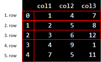
We see that "col1", "col2" and "col3" are the names of the columns.
Do not be confused about the vertical numbers ranging from 0-4. They tell us the information about the position of the rows.
In Python, the numbering of rows starts with zero.
Now, we can use Python to count the columns and rows.
We can use df.shape[1] to find the number of columns:
Example
Count the number of columns:
count_column = df.shape[1]
print(count_column)
We can use df.shape[0] to find the number of rows:
Example
Count the number of rows:
count_row = df.shape[0]
print(count_row)
Why Can We Not Just Count the Rows and Columns Ourselves?
If we work with larger data sets with many columns and rows, it will be confusing to count it by yourself. You risk to count it wrongly. If we use the built-in functions in Python correctly, we assure that the count is correct.
This chapter shows three commonly used functions when working with Data Science: max(), min(), and mean().
The Sports Watch Data Set
|
Duration
|
Average_Pulse
|
Max_Pulse
|
Calorie_Burnage
|
Hours_Work
|
Hours_Sleep
|
|
30
|
80
|
120
|
240
|
10
|
7
|
|
30
|
85
|
120
|
250
|
10
|
7
|
|
45
|
90
|
130
|
260
|
8
|
7
|
|
45
|
95
|
130
|
270
|
8
|
7
|
|
45
|
100
|
140
|
280
|
0
|
7
|
|
60
|
105
|
140
|
290
|
7
|
8
|
|
60
|
110
|
145
|
300
|
7
|
8
|
|
60
|
115
|
145
|
310
|
8
|
8
|
|
75
|
120
|
150
|
320
|
0
|
8
|
|
75
|
125
|
150
|
330
|
8
|
8
|
The data set above consists of 6 variables, each with 10 observations:
- Duration - How long lasted the training session in minutes?
- Average_Pulse - What was the average pulse of the training session? This is measured by beats per minute
- Max_Pulse - What was the max pulse of the training session?
- Calorie_Burnage - How much calories were burnt on the training session?
- Hours_Work - How many hours did we work at our job before the training session?
- Hours_Sleep - How much did we sleep the night before the training session?
We use underscore (_) to separate strings because Python cannot read space as separator.
The max() function
The Python max() function is used to find the highest value in an array.
Example
Average_pulse_max = max(80, 85, 90, 95, 100, 105, 110, 115, 120, 125)
print (Average_pulse_max)
The min() function
The Python min() function is used to find the lowest value in an array.
Example
Average_pulse_min = min(80, 85, 90, 95, 100, 105, 110, 115, 120, 125)
print (Average_pulse_min)
The mean() function
The NumPy mean() function is used to find the average value of an array.
Example
import numpy as np
Calorie_burnage = [240, 250, 260, 270, 280, 290, 300, 310, 320, 330]
Average_calorie_burnage = np.mean(Calorie_burnage)
print(Average_calorie_burnage)
Note: We write np. in front of mean to let Python know that we want to activate the mean function from the Numpy library.
Before analyzing data, a Data Scientist must extract the data, and make it clean and valuable.
Extract and Read Data With Pandas
Before data can be analyzed, it must be imported/extracted.
In the example below, we show you how to import data using Pandas in Python.
We use the read_csv() function to import a CSV file with the health data:
Example
import pandas as pd
health_data = pd.read_csv("data.csv", header=0, sep=",")
print(health_data)
Example Explained
- Import the Pandas library
- Name the data frame as
health_data.
header=0 means that the headers for the variable names are to be found in the first row (note that 0 means the first row in Python)sep="," means that "," is used as the separator between the values. This is because we are using the file type .csv (comma separated values)
Tip: If you have a large CSV file, you can use the head() function to only show the top 5rows:
Example
import pandas as pd
health_data = pd.read_csv("data.csv", header=0, sep=",")
print(health_data.head())
Data Cleaning
Look at the imported data. As you can see, the data are "dirty" with wrongly or unregistered values:
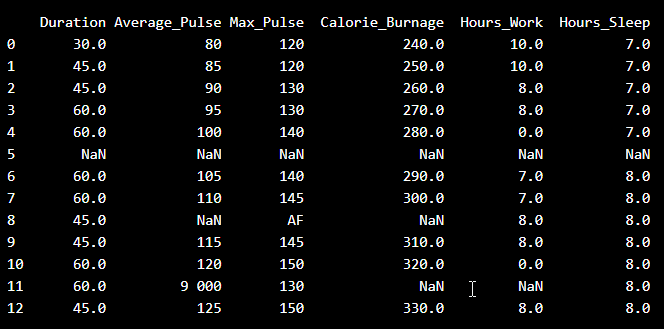
- There are some blank fields
- Average pulse of 9 000 is not possible
- 9 000 will be treated as non-numeric, because of the space separator
- One observation of max pulse is denoted as "AF", which does not make sense
So, we must clean the data in order to perform the analysis.
Remove Blank Rows
We see that the non-numeric values (9 000 and AF) are in the same rows with missing values.
Solution: We can remove the rows with missing observations to fix this problem.
When we load a data set using Pandas, all blank cells are automatically converted into "NaN" values.
So, removing the NaN cells gives us a clean data set that can be analyzed.
We can use the dropna() function to remove the NaNs. axis=0 means that we want to remove all rows that have a NaN value:
Example
health_data.dropna(axis=0,inplace=True)
print(health_data)
The result is a data set without NaN rows:

Data Categories
To analyze data, we also need to know the types of data we are dealing with.
Data can be split into three main categories:
- Numerical - Contains numerical values. Can be divided into two categories:
- Discrete: Numbers are counted as "whole". Example: You cannot have trained 2.5 sessions, it is either 2 or 3
- Continuous: Numbers can be of infinite precision. For example, you can sleep for 7 hours, 30 minutes and 20 seconds, or 7.533 hours
- Categorical - Contains values that cannot be measured up against each other. Example: A color or a type of training
- Ordinal - Contains categorical data that can be measured up against each other. Example: School grades where A is better than B and so on
By knowing the type of your data, you will be able to know what technique to use when analyzing them.
Data Types
We can use the info() function to list the data types within our data set:
Example
print(health_data.info())
Result:
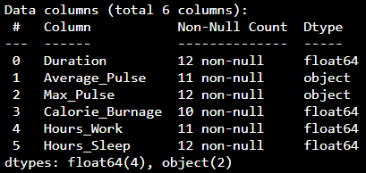
We see that this data set has two different types of data:
We cannot use objects to calculate and perform analysis here. We must convert the type object to float64 (float64 is a number with a decimal in Python).
We can use the astype() function to convert the data into float64.
The following example converts "Average_Pulse" and "Max_Pulse" into data type float64 (the other variables are already of data type float64):
Example
health_data["Average_Pulse"] = health_data['Average_Pulse'].astype(float)
health_data["Max_Pulse"] = health_data["Max_Pulse"].astype(float)
print (health_data.info())
Result:
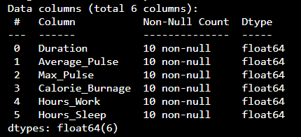
Now, the data set has only float64 data types.
Analyze the Data
When we have cleaned the data set, we can start analyzing the data.
We can use the describe() function in Python to summarize data:
Example
print(health_data.describe())
Result:
|
|
Duration
|
Average_Pulse
|
Max_Pulse
|
Calorie_Burnage
|
Hours_Work
|
Hours_Sleep
|
|
Count
|
10.0
|
10.0
|
10.0
|
10.0
|
10.0
|
10.0
|
|
Mean
|
51.0
|
102.5
|
137.0
|
285.0
|
6.6
|
7.5
|
|
Std
|
10.49
|
15.4
|
11.35
|
30.28
|
3.63
|
0.53
|
|
Min
|
30.0
|
80.0
|
120.0
|
240.0
|
0.0
|
7.0
|
|
25%
|
45.0
|
91.25
|
130.0
|
262.5
|
7.0
|
7.0
|
|
50%
|
52.5
|
102.5
|
140.0
|
285.0
|
8.0
|
7.5
|
|
75%
|
60.0
|
113.75
|
145.0
|
307.5
|
8.0
|
8.0
|
|
Max
|
60.0
|
125.0
|
150.0
|
330.0
|
10.0
|
8.0
|
- Count - Counts the number of observations
- Mean - The average value
- Std - Standard deviation (explained in the statistics chapter)
- Min - The lowest value
- 25%, 50% and 75% are percentiles (explained in the statistics chapter)
- Max - The highest value
Mathematical functions are important to know as a data scientist, because we want to make predictions and interpret them.
Linear Functions
In mathematics a function is used to relate one variable to another variable.
Suppose we consider the relationship between calorie burnage and average pulse. It is reasonable to assume that, in general, the calorie burnage will change as the average pulse changes - we say that the calorie burnage depends upon the average pulse.
Furthermore, it may be reasonable to assume that as the average pulse increases, so will the calorie burnage. Calorie burnage and average pulse are the two variables being considered.
Because the calorie burnage depends upon the average pulse, we say that calorie burnage is the dependent variable and the average pulse is the independent variable.
The relationship between a dependent and an independent variable can often be expressed mathematically using a formula (function).
A linear function has one independent variable (x) and one dependent variable (y), and has the following form:
y = f(x) = ax + b
This function is used to calculate a value for the dependent variable when we choose a value for the independent variable.
Explanation:
- f(x) = the output (the dependant variable)
- x = the input (the independant variable)
- a = slope = is the coefficient of the independent variable. It gives the rate of change of the dependent variable
- b = intercept = is the value of the dependent variable when x = 0. It is also the point where the diagonal line crosses the vertical axis.
Linear Function With One Explanatory Variable
A function with one explanatory variable means that we use one variable for prediction.
Let us say we want to predict calorie burnage using average pulse. We have the following formula:
f(x) = 2x + 80
Here, the numbers and variables means:
- f(x) = The output. This number is where we get the predicted value of Calorie_Burnage
- x = The input, which is Average_Pulse
- 2 = Slope = Specifies how much Calorie_Burnage increases if Average_Pulse increases by one. It tells us how "steep" the diagonal line is
- 80 = Intercept = A fixed value. It is the value of the dependent variable when x = 0
Plotting a Linear Function
The term linearity means a "straight line". So, if you show a linear function graphically, the line will always be a straight line. The line can slope upwards, downwards, and in some cases may be horizontal or vertical.
Here is a graphical representation of the mathematical function above:
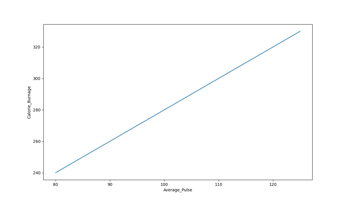
Graph Explanations:
- The horizontal axis is generally called the x-axis. Here, it represents Average_Pulse.
- The vertical axis is generally called the y-axis. Here, it represents Calorie_Burnage.
- Calorie_Burnage is a function of Average_Pulse, because Calorie_Burnage is assumed to be dependent on Average_Pulse.
- In other words, we use Average_Pulse to predict Calorie_Burnage.
- The blue (diagonal) line represents the structure of the mathematical function that predicts calorie burnage.
The Sports Watch Data Set
Take a look at our health data set:
|
Duration
|
Average_Pulse
|
Max_Pulse
|
Calorie_Burnage
|
Hours_Work
|
Hours_Sleep
|
|
30
|
80
|
120
|
240
|
10
|
7
|
|
30
|
85
|
120
|
250
|
10
|
7
|
|
45
|
90
|
130
|
260
|
8
|
7
|
|
45
|
95
|
130
|
270
|
8
|
7
|
|
45
|
100
|
140
|
280
|
0
|
7
|
|
60
|
105
|
140
|
290
|
7
|
8
|
|
60
|
110
|
145
|
300
|
7
|
8
|
|
60
|
115
|
145
|
310
|
8
|
8
|
|
75
|
120
|
150
|
320
|
0
|
8
|
|
75
|
125
|
150
|
330
|
8
|
8
|
Plot the Existing Data in Python
Now, we can first plot the values of Average_Pulse against Calorie_Burnage using the matplotlib library.
The plot() function is used to make a 2D hexagonal binning plot of points x,y:
Example
import matplotlib.pyplot as plt
health_data.plot(x ='Average_Pulse', y='Calorie_Burnage', kind='line'),
plt.ylim(ymin=0)
plt.xlim(xmin=0)
plt.show()
Example Explained
- Import the pyplot module of the matplotlib library
- Plot the data from Average_Pulse against Calorie_Burnage
- kind='line' tells us which type of plot we want. Here, we want to have a straight line
- plt.ylim() and plt.xlim() tells us what value we want the axis to start on. Here, we want the axis to begin from zero
- plt.show() shows us the output
The code above will produce the following result:
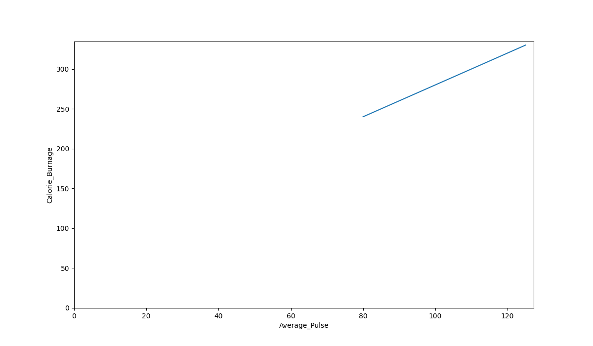
The Graph Output
As we can see, there is a relationship between Average_Pulse and Calorie_Burnage. Calorie_Burnage increases proportionally with Average_Pulse. It means that we can use Average_Pulse to predict Calorie_Burnage.
Why is The Line Not Fully Drawn Down to The y-axis?
The reason is that we do not have observations where Average_Pulse or Calorie_Burnage are equal to zero. 80 is the first observation of Average_Pulse and 240 is the first observation of Calorie_Burnage.
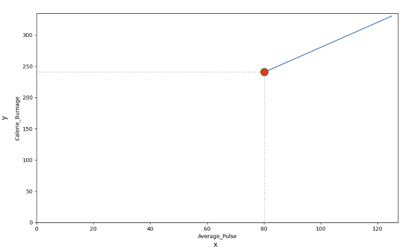
Look at the line. What happens to calorie burnage if average pulse increases from 80 to 90?
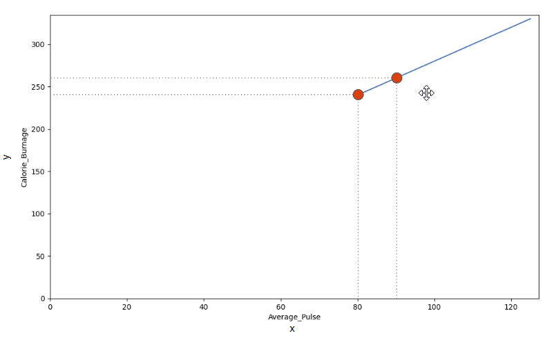
We can use the diagonal line to find the mathematical function to predict calorie burnage.
As it turns out:
- If the average pulse is 80, the calorie burnage is 240
- If the average pulse is 90, the calorie burnage is 260
- If the average pulse is 100, the calorie burnage is 280
There is a pattern. If average pulse increases by 10, the calorie burnage increases by 20.
Slope and Intercept
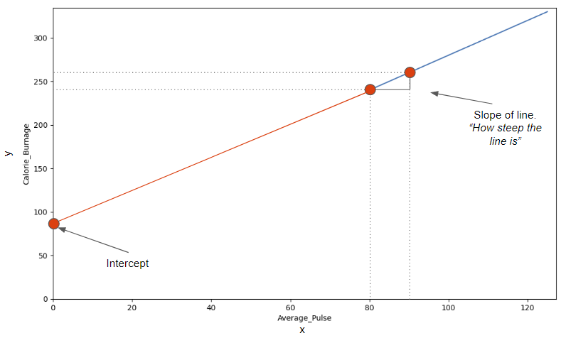
Now we will explain how we found the slope and intercept of our function:
f(x) = 2x + 80
The image below points to the Slope - which indicates how steep the line is, and the Intercept - which is the value of y, when x = 0 (the point where the diagonal line crosses the vertical axis). The red line is the continuation of the blue line from previous page.
Find The Slope
The slope is defined as how much calorie burnage increases, if average pulse increases by one. It tells us how "steep" the diagonal line is.
We can find the slope by using the proportional difference of two points from the graph.
- If the average pulse is 80, the calorie burnage is 240
- If the average pulse is 90, the calorie burnage is 260
We see that if average pulse increases with 10, the calorie burnage increases by 20.
Slope = 20/10 = 2
The slope is 2.
Mathematically, Slope is Defined as:
Slope = f(x2) - f(x1) / x2-x1
f(x2) = Second observation of Calorie_Burnage = 260
f(x1) = First observation of Calorie_Burnage = 240
x2 = Second observation of Average_Pulse = 90
x1 = First observation of Average_Pulse = 80
Slope = (260-240) / (90 - 80) = 2
Be consistent to define the observations in the correct order! If not, the prediction will not be correct!
Use Python to Find the Slope
Calculate the slope with the following code:
Example
def slope(x1, y1, x2, y2):
s = (y2-y1)/(x2-x1)
return s
print (slope(80,240,90,260))
Find The Intercept
The intercept is used to fine tune the functions ability to predict Calorie_Burnage.
The intercept is where the diagonal line crosses the y-axis, if it were fully drawn.
The intercept is the value of y, when x = 0.
Here, we see that if average pulse (x) is zero, then the calorie burnage (y) is 80.
So, the intercept is 80.
Sometimes, the intercept has a practical meaning. Sometimes not.
Does it make sense that average pulse is zero?
No, you would be dead and you certainly would not burn any calories.
However, we need to include the intercept in order to complete the mathematical function's ability to predict Calorie_Burnage correctly.
Other examples where the intercept of a mathematical function can have a practical meaning:
- Predicting next years revenue by using marketing expenditure (How much revenue will we have next year, if marketing expenditure is zero?). It is likely to assume that a company will still have some revenue even though if it does not spend money on marketing.
- Fuel usage with speed (How much fuel do we use if speed is equal to 0 mph?). A car that uses gasoline will still use fuel when it is idle.
Find the Slope and Intercept Using Python
The np.polyfit() function returns the slope and intercept.
If we proceed with the following code, we can both get the slope and intercept from the function.
Example
import pandas as pd
import numpy as np
health_data = pd.read_csv("data.csv", header=0, sep=",")
x = health_data["Average_Pulse"]
y = health_data["Calorie_Burnage"]
slope_intercept = np.polyfit(x,y,1)
print(slope_intercept)
Example Explained:
- Isolate the variables Average_Pulse (x) and Calorie_Burnage (y) from health_data.
- Call the np.polyfit() function.
- The last parameter of the function specifies the degree of the function, which in this case is "1".
Tip: linear functions = 1.degree function. In our example, the function is linear, which is in the 1.degree. That means that all coefficients (the numbers) are in the power of one.
We have now calculated the slope (2) and the intercept (80). We can write the mathematical function as follow:
Predict Calorie_Burnage by using a mathematical expression:
f(x) = 2x + 80
Task:
Now, we want to predict calorie burnage if average pulse is 135.
Remember that the intercept is a constant. A constant is a number that does not change.
We can now substitute the input x with 135:
f(135) = 2 * 135 + 80 = 350
If average pulse is 135, the calorie burnage is 350.
Define the Mathematical Function in Python
Here is the exact same mathematical function, but in Python. The function returns 2*x + 80, with x as the input:
Example
def my_function(x):
return 2*x + 80
print (my_function(135))
Try to replace x with 140 and 150.
Plot a New Graph in Python
Here, we plot the same graph as earlier, but formatted the axis a little bit.
Max value of the y-axis is now 400 and for x-axis is 150:
Example
import matplotlib.pyplot as plt
health_data.plot(x ='Average_Pulse', y='Calorie_Burnage', kind='line'),
plt.ylim(ymin=0, ymax=400)
plt.xlim(xmin=0, xmax=150)
plt.show()
Example Explained
- Import the pyplot module of the matplotlib library
- Plot the data from Average_Pulse against Calorie_Burnage
- kind='line' tells us which type of plot we want. Here, we want to have a straight line
- plt.ylim() and plt.xlim() tells us what value we want the axis to start and stop on.
- plt.show() shows us the output
Introduction to Statistics
Statistics is the science of analyzing data.
When we have created a model for prediction, we must assess the prediction's reliability.
After all, what is a prediction worth, if we cannot rely on it?
Descriptive Statistics
We will first cover some basic descriptive statistics.
Descriptive statistics summarizes important features of a data set such as:
- Count
- Sum
- Standard Deviation
- Percentile
- Average
- Etc..
It is a good starting point to become familiar with the data.
We can use the describe() function in Python to summarize the data:
Example
print (full_health_data.describe())
Output:

Do you see anything interesting here?
25%, 50% and 75% - Percentiles
Percentiles are used in statistics to give you a number that describes the value that a given percent of the values are lower than.

Let us try to explain it by some examples, using Average_Pulse.
- The 25% percentile of Average_Pulse means that 25% of all of the training sessions have an average pulse of 100 beats per minute or lower. If we flip the statement, it means that 75% of all of the training sessions have an average pulse of 100 beats per minute or higher
- The 75% percentile of Average_Pulse means that 75% of all the training session have an average pulse of 111 or lower. If we flip the statement, it means that 25% of all of the training sessions have an average pulse of 111 beats per minute or higher
Task: Find the 10% percentile for Max_Pulse
The following example shows how to do it in Python:
Example
import numpy as np
Max_Pulse= full_health_data["Max_Pulse"]
percentile10 = np.percentile(Max_Pulse, 10)
print(percentile10)
- Max_Pulse = full_health_data["Max_Pulse"] - Isolate the variable Max_Pulse from the full health data set.
- np.percentile() is used to define that we want the 10% percentile from Max_Pulse.
The 10% percentile of Max_Pulse is 120. This means that 10% of all the training sessions have a Max_Pulse of 120 or lower.

Standard Deviation
Standard deviation is a number that describes how spread out the observations are.

A mathematical function will have difficulties in predicting precise values, if the observations are "spread". Standard deviation is a measure of uncertainty.
A low standard deviation means that most of the numbers are close to the mean (average) value.
A high standard deviation means that the values are spread out over a wider range.
Tip: Standard Deviation is often represented by the symbol Sigma: σ
We can use the std() function from Numpy to find the standard deviation of a variable:
Example
import numpy as np
std = np.std(full_health_data)
print(std)
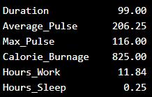
The output:
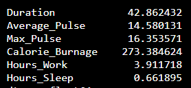
What does these numbers mean?
Coefficient of Variation
The coefficient of variation is used to get an idea of how large the standard deviation is.
Mathematically, the coefficient of variation is defined as:
Coefficient of Variation = Standard Deviation / Mean
We can do this in Python if we proceed with the following code:
Example
import numpy as np
cv = np.std(full_health_data) / np.mean(full_health_data)
print(cv)
The output:
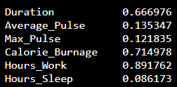
We see that the variables Duration, Calorie_Burnage and Hours_Work has a high Standard Deviation compared to Max_Pulse, Average_Pulse and Hours_Sleep.

Variance
Variance is another number that indicates how spread out the values are.
In fact, if you take the square root of the variance, you get the standard deviation. Or the other way around, if you multiply the standard deviation by itself, you get the variance!
We will first use the data set with 10 observations to give an example of how we can calculate the variance:
|
Duration
|
Average_Pulse
|
Max_Pulse
|
Calorie_Burnage
|
Hours_Work
|
Hours_Sleep
|
|
30
|
80
|
120
|
240
|
10
|
7
|
|
30
|
85
|
120
|
250
|
10
|
7
|
|
45
|
90
|
130
|
260
|
8
|
7
|
|
45
|
95
|
130
|
270
|
8
|
7
|
|
45
|
100
|
140
|
280
|
0
|
7
|
|
60
|
105
|
140
|
290
|
7
|
8
|
|
60
|
110
|
145
|
300
|
7
|
8
|
|
60
|
115
|
145
|
310
|
8
|
8
|
|
75
|
120
|
150
|
320
|
0
|
8
|
|
75
|
125
|
150
|
330
|
8
|
8
|
Tip: Variance is often represented by the symbol Sigma Square: σ^2
Step 1 to Calculate the Variance: Find the Mean
We want to find the variance of Average_Pulse.
1. Find the mean:
(80+85+90+95+100+105+110+115+120+125) / 10 = 102.5
The mean is 102.5
Step 2: For Each Value - Find the Difference From the Mean
2. Find the difference from the mean for each value:
80 - 102.5 = -22.5
85 - 102.5 = -17.5
90 - 102.5 = -12.5
95 - 102.5 = -7.5
100 - 102.5 = -2.5
105 - 102.5 = 2.5
110 - 102.5 = 7.5
115 - 102.5 = 12.5
120 - 102.5 = 17.5
125 - 102.5 = 22.5
Step 3: For Each Difference - Find the Square Value
3. Find the square value for each difference:
(-22.5)^2 = 506.25
(-17.5)^2 = 306.25
(-12.5)^2 = 156.25
(-7.5)^2 = 56.25
(-2.5)^2 = 6.25
2.5^2 = 6.25
7.5^2 = 56.25
12.5^2 = 156.25
17.5^2 = 306.25
22.5^2 = 506.25
Note: We must square the values to get the total spread.
Step 4: The Variance is the Average Number of These Squared Values
4. Sum the squared values and find the average:
(506.25 + 306.25 + 156.25 + 56.25 + 6.25 + 6.25 + 56.25 + 156.25 + 306.25 + 506.25) / 10 = 206.25
The variance is 206.25.
Use Python to Find the Variance of health_data
We can use the var() function from Numpy to find the variance (remember that we now use the first data set with 10 observations):
Example
import numpy as np
var = np.var(health_data)
print(var)
The output:
Use Python to Find the Variance of Full Data Set
Here we calculate the variance for each column for the full data set:
Example
import numpy as np
var_full = np.var(full_health_data)
print(var_full)
The output:
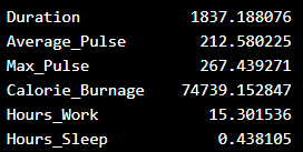
.png)
Correlation
Correlation measures the relationship between two variables.
We mentioned that a function has a purpose to predict a value, by converting input (x) to output (f(x)). We can say also say that a function uses the relationship between two variables for prediction.
Correlation Coefficient
The correlation coefficient measures the relationship between two variables.
The correlation coefficient can never be less than -1 or higher than 1.
- 1 = there is a perfect linear relationship between the variables (like Average_Pulse against Calorie_Burnage)
- 0 = there is no linear relationship between the variables
- -1 = there is a perfect negative linear relationship between the variables (e.g. Less hours worked, leads to higher calorie burnage during a training session)
Example of a Perfect Linear Relationship (Correlation Coefficient = 1)
We will use scatterplot to visualize the relationship between Average_Pulse and Calorie_Burnage (we have used the small data set of the sports watch with 10 observations).
This time we want scatter plots, so we change kind to "scatter":
Example
import matplotlib.pyplot as plt
health_data.plot(x ='Average_Pulse', y='Calorie_Burnage', kind='scatter')
plt.show()
Output:
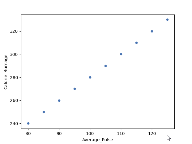
As we saw earlier, it exists a perfect linear relationship between Average_Pulse and Calorie_Burnage.
Example of a Perfect Negative Linear Relationship (Correlation Coefficient = -1)
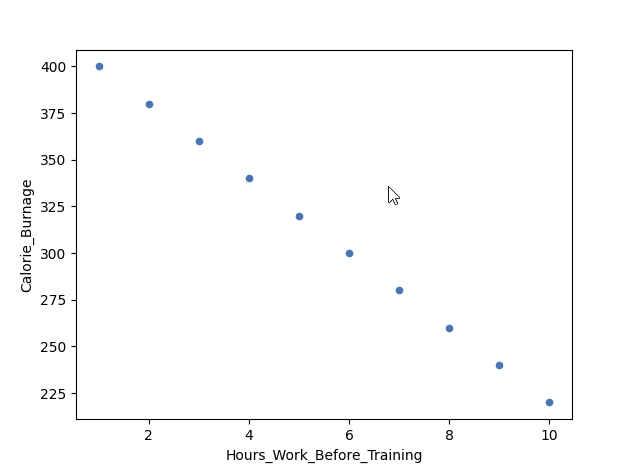
We have plotted fictional data here. The x-axis represents the amount of hours worked at our job before a training session. The y-axis is Calorie_Burnage.
If we work longer hours, we tend to have lower calorie burnage because we are exhausted before the training session.
The correlation coefficient here is -1.
Example
import pandas as pd
import matplotlib.pyplot as plt
negative_corr = {'Hours_Work_Before_Training': [10,9,8,7,6,5,4,3,2,1],
'Calorie_Burnage': [220,240,260,280,300,320,340,360,380,400]}
negative_corr = pd.DataFrame(data=negative_corr)
negative_corr.plot(x ='Hours_Work_Before_Training', y='Calorie_Burnage', kind='scatter')
plt.show()
Example of No Linear Relationship (Correlation coefficient = 0)
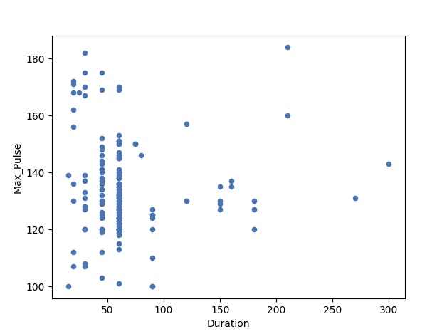
Here, we have plotted Max_Pulse against Duration from the full_health_data set.
As you can see, there is no linear relationship between the two variables. It means that longer training session does not lead to higher Max_Pulse.
The correlation coefficient here is 0.
Example
import matplotlib.pyplot as plt
full_health_data.plot(x ='Duration', y='Max_Pulse', kind='scatter')
plt.show()

Correlation Matrix
A matrix is an array of numbers arranged in rows and columns.
A correlation matrix is simply a table showing the correlation coefficients between variables.
Here, the variables are represented in the first row, and in the first column:
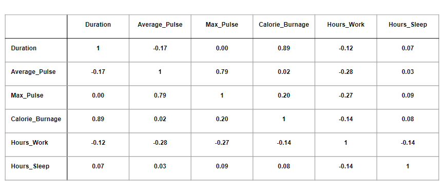
The table above has used data from the full health data set.
Observations:
- We observe that Duration and Calorie_Burnage are closely related, with a correlation coefficient of 0.89. This makes sense as the longer we train, the more calories we burn
- We observe that there is almost no linear relationships between Average_Pulse and Calorie_Burnage (correlation coefficient of 0.02)
- Can we conclude that Average_Pulse does not affect Calorie_Burnage? No. We will come back to answer this question later!
Correlation Matrix in Python
We can use the corr() function in Python to create a correlation matrix. We also use the round() function to round the output to two decimals:
Example
Corr_Matrix = round(full_health_data.corr(),2)
print(Corr_Matrix)
Output:

Using a Heatmap
We can use a Heatmap to Visualize the Correlation Between Variables:
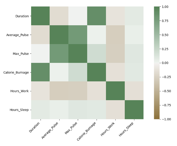
The closer the correlation coefficient is to 1, the greener the squares get.
The closer the correlation coefficient is to -1, the browner the squares get.
Use Seaborn to Create a Heatmap
We can use the Seaborn library to create a correlation heat map (Seaborn is a visualization library based on matplotlib):
Example
import matplotlib.pyplot as plt
import seaborn as sns
correlation_full_health = full_health_data.corr()
axis_corr = sns.heatmap(
correlation_full_health,
vmin=-1, vmax=1, center=0,
cmap=sns.diverging_palette(50, 500, n=500),
square=True
)
plt.show()
Example Explained:
- Import the library seaborn as sns.
- Use the full_health_data set.
- Use sns.heatmap() to tell Python that we want a heatmap to visualize the correlation matrix.
- Use the correlation matrix. Define the maximal and minimal values of the heatmap. Define that 0 is the center.
- Define the colors with sns.diverging_palette. n=500 means that we want 500 types of color in the same color palette.
- square = True means that we want to see squares.

Correlation Does Not Imply Causality
Correlation measures the numerical relationship between two variables.
A high correlation coefficient (close to 1), does not mean that we can for sure conclude an actual relationship between two variables.
A classic example:
- During the summer, the sale of ice cream at a beach increases
- Simultaneously, drowning accidents also increase as well
Does this mean that increase of ice cream sale is a direct cause of increased drowning accidents?
The Beach Example in Python
Here, we constructed a fictional data set for you to try:
Example
import pandas as pd
import matplotlib.pyplot as plt
Drowning_Accident = [20,40,60,80,100,120,140,160,180,200]
Ice_Cream_Sale = [20,40,60,80,100,120,140,160,180,200]
Drowning = {"Drowning_Accident": [20,40,60,80,100,120,140,160,180,200],
"Ice_Cream_Sale": [20,40,60,80,100,120,140,160,180,200]}
Drowning = pd.DataFrame(data=Drowning)
Drowning.plot(x="Ice_Cream_Sale", y="Drowning_Accident", kind="scatter")
plt.show()
correlation_beach = Drowning.corr()
print(correlation_beach)
Output:
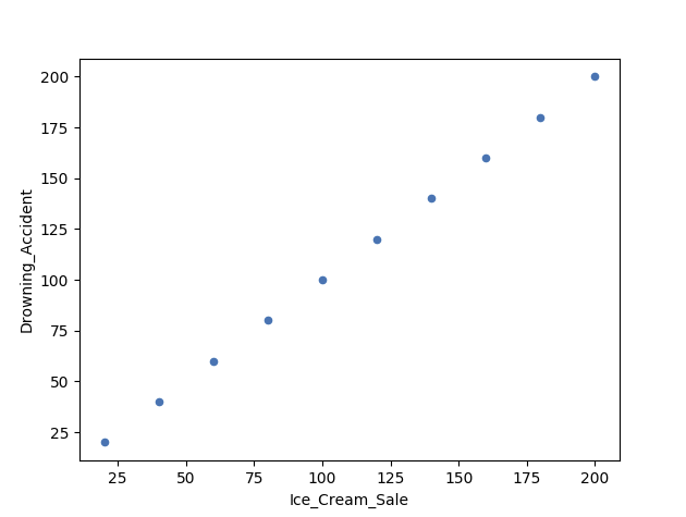
Correlation vs Causality - The Beach Example
In other words: can we use ice cream sale to predict drowning accidents?
The answer is - Probably not.
It is likely that these two variables are accidentally correlating with each other.
What causes drowning then?
- Unskilled swimmers
- Waves
- Cramp
- Seizure disorders
- Lack of supervision
- Alcohol (mis)use
- etc.
Let us reverse the argument:
Does a low correlation coefficient (close to zero) mean that change in x does not affect y?
Back to the question:
- Can we conclude that Average_Pulse does not affect Calorie_Burnage because of a low correlation coefficient?
The answer is no.
There is an important difference between correlation and causality:
- Correlation is a number that measures how closely the data are related
- Causality is the conclusion that x causes y.
Tip: Always critically reflect over the concept of causality when doing predictions!

We are missing one important variable that affects Calorie_Burnage, which is the Duration of the training session.
Duration in combination with Average_Pulse will together explain Calorie_Burnage more precisely.
Linear Regression
The term regression is used when you try to find the relationship between variables.
In Machine Learning and in statistical modeling, that relationship is used to predict the outcome of events.
In this module, we will cover the following questions:
- Can we conclude that Average_Pulse and Duration are related to Calorie_Burnage?
- Can we use Average_Pulse and Duration to predict Calorie_Burnage?
Least Square Method
Linear regression uses the least square method.
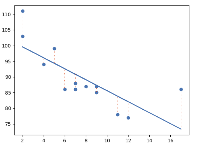
The concept is to draw a line through all the plotted data points. The line is positioned in a way that it minimizes the distance to all of the data points.
The distance is called "residuals" or "errors".
The red dashed lines represents the distance from the data points to the drawn mathematical function.
Linear Regression Using One Explanatory Variable
In this example, we will try to predict Calorie_Burnage with Average_Pulse using Linear Regression:
Example
import pandas as pd
import matplotlib.pyplot as plt
from scipy import stats
full_health_data = pd.read_csv("data.csv", header=0, sep=",")
x = full_health_data["Average_Pulse"]
y = full_health_data ["Calorie_Burnage"]
slope, intercept, r, p, std_err = stats.linregress(x, y)
def myfunc(x):
return slope * x + intercept
mymodel = list(map(myfunc, x))
plt.scatter(x, y)
plt.plot(x, slope * x + intercept)
plt.ylim(ymin=0, ymax=2000)
plt.xlim(xmin=0, xmax=200)
plt.xlabel("Average_Pulse")
plt.ylabel ("Calorie_Burnage")
plt.show()
Example Explained:
- Import the modules you need: Pandas, matplotlib and Scipy
- Isolate Average_Pulse as x. Isolate Calorie_burnage as y
- Get important key values with: slope, intercept, r, p, std_err = stats.linregress(x, y)
- Create a function that uses the slope and intercept values to return a new value. This new value represents where on the y-axis the corresponding x value will be placed
- Run each value of the x array through the function. This will result in a new array with new values for the y-axis: mymodel = list(map(myfunc, x))
- Draw the original scatter plot: plt.scatter(x, y)
- Draw the line of linear regression: plt.plot(x, mymodel)
- Define maximum and minimum values of the axis
- Label the axis: "Average_Pulse" and "Calorie_Burnage"
Output:
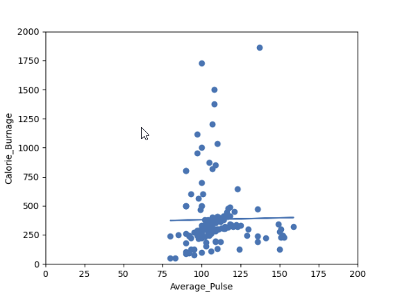
Do you think that the line is able to predict Calorie_Burnage precisely?
We will show that the variable Average_Pulse alone is not enough to make precise prediction of Calorie_Burnage.
Regression Table
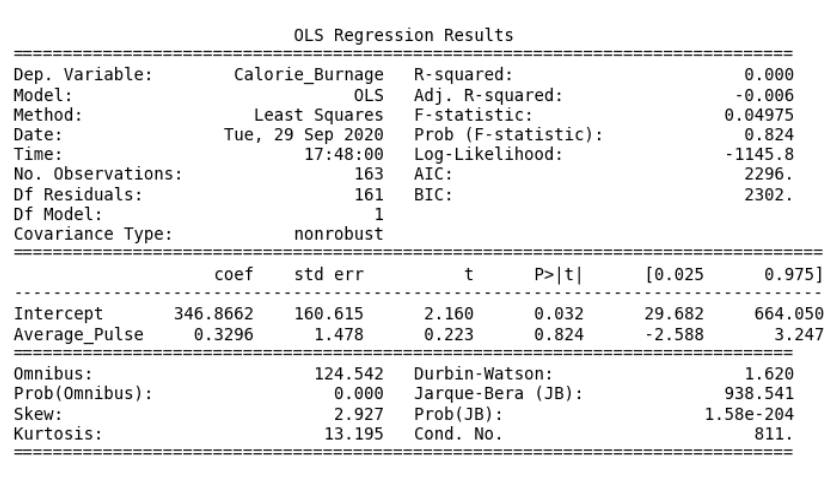
The output from linear regression can be summarized in a regression table.
The content of the table includes:
- Information about the model
- Coefficients of the linear regression function
- Regression statistics
- Statistics of the coefficients from the linear regression function
- Other information that we will not cover in this module
Regression Table with Average_Pulse as Explanatory Variable
You can now begin your journey on analyzing advanced output!
Create a Linear Regression Table in Python
Here is how to create a linear regression table in Python:
Example
import pandas as pd
import statsmodels.formula.api as smf
full_health_data = pd.read_csv("data.csv", header=0, sep=",")
model = smf.ols('Calorie_Burnage ~ Average_Pulse', data = full_health_data)
results = model.fit()
print(results.summary())
Example Explained:
- Import the library statsmodels.formula.api as smf. Statsmodels is a statistical library in Python.
- Use the full_health_data set.
- Create a model based on Ordinary Least Squares with smf.ols(). Notice that the explanatory variable must be written first in the parenthesis. Use the full_health_data data set.
- By calling .fit(), you obtain the variable results. This holds a lot of information about the regression model.
- Call summary() to get the table with the results of linear regression.
The "Information Part" in Regression Table
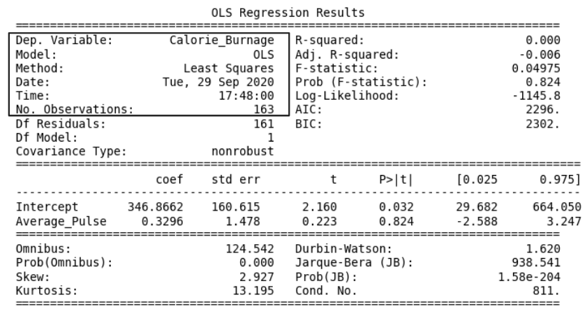
- Dep. Variable: is short for "Dependent Variable". Calorie_Burnage is here the dependent variable. The Dependent variable is here assumed to be explained by Average_Pulse.
- Model: OLS is short for Ordinary Least Squares. This is a type of model that uses the Least Square method.
- Date: and Time: shows the date and time the output was calculated in Python.
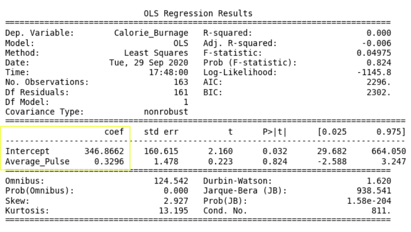
The "Coefficients Part" in Regression Table

- Coef is short for coefficient. It is the output of the linear regression function.
The linear regression function can be rewritten mathematically as:
Calorie_Burnage = 0.3296 * Average_Pulse + 346.8662
These numbers means:
- If Average_Pulse increases by 1, Calorie_Burnage increases by 0.3296 (or 0,3 rounded)
- If Average_Pulse = 0, the Calorie_Burnage is equal to 346.8662 (or 346.9 rounded).
- Remember that the intercept is used to adjust the model's precision of predicting!
Do you think that this is a good model?
Define the Linear Regression Function in Python
Define the linear regression function in Python to perform predictions.
What is Calorie_Burnage if Average_Pulse is: 120, 130, 150, 180?
Example
def Predict_Calorie_Burnage(Average_Pulse):
return(0.3296*Average_Pulse + 346.8662)
print(Predict_Calorie_Burnage(120))
print(Predict_Calorie_Burnage(130))
print(Predict_Calorie_Burnage(150))
print(Predict_Calorie_Burnage(180))
The "Statistics of the Coefficients Part" in Regression Table
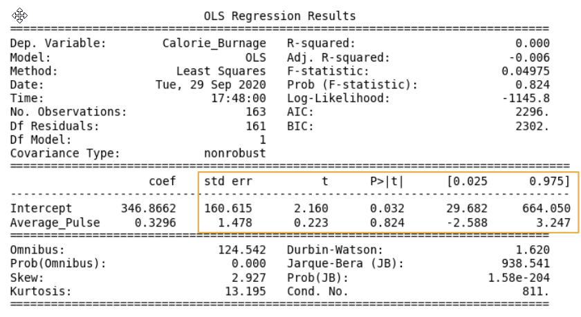
Now, we want to test if the coefficients from the linear regression function has a significant impact on the dependent variable (Calorie_Burnage).
This means that we want to prove that it exists a relationship between Average_Pulse and Calorie_Burnage, using statistical tests.
There are four components that explains the statistics of the coefficients:
- std err stands for Standard Error
- t is the "t-value" of the coefficients
- P>|t| is called the "P-value"
- [0.025 0.975] represents the confidence interval of the coefficients
We will focus on understanding the "P-value" in this module.
The P-value
The P-value is a statistical number to conclude if there is a relationship between Average_Pulse and Calorie_Burnage.
We test if the true value of the coefficient is equal to zero (no relationship). The statistical test for this is called Hypothesis testing.
- A low P-value (< 0.05) means that the coefficient is likely not to equal zero.
- A high P-value (> 0.05) means that we cannot conclude that the explanatory variable affects the dependent variable (here: if Average_Pulse affects Calorie_Burnage).
- A high P-value is also called an insignificant P-value.
Hypothesis Testing
Hypothesis testing is a statistical procedure to test if your results are valid.
In our example, we are testing if the true coefficient of Average_Pulse and the intercept is equal to zero.
Hypothesis test has two statements. The null hypothesis and the alternative hypothesis.
- The null hypothesis can be shortly written as H0
- The alternative hypothesis can be shortly written as HA
Mathematically written:
H0: Average_Pulse = 0
HA: Average_Pulse ≠ 0
H0: Intercept = 0
HA: Intercept ≠ 0
The sign ≠ means "not equal to"
Hypothesis Testing and P-value
The null hypothesis can either be rejected or not.
If we reject the null hypothesis, we conclude that it exist a relationship between Average_Pulse and Calorie_Burnage. The P-value is used for this conclusion.
A common threshold of the P-value is 0.05.
Note: A P-value of 0.05 means that 5% of the times, we will falsely reject the null hypothesis. It means that we accept that 5% of the times, we might falsely have concluded a relationship.
If the P-value is lower than 0.05, we can reject the null hypothesis and conclude that it exist a relationship between the variables.
However, the P-value of Average_Pulse is 0.824. So, we cannot conclude a relationship between Average_Pulse and Calorie_Burnage.
It means that there is a 82.4% chance that the true coefficient of Average_Pulse is zero.
The intercept is used to adjust the regression function's ability to predict more precisely. It is therefore uncommon to interpret the P-value of the intercept.
R - Squared
R-Squared and Adjusted R-Squared describes how well the linear regression model fits the data points:
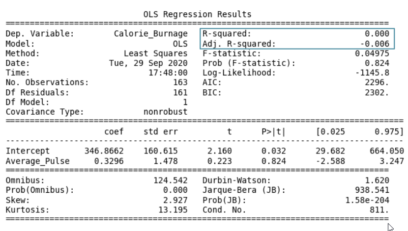
The value of R-Squared is always between 0 to 1 (0% to 100%).
- A high R-Squared value means that many data points are close to the linear regression function line.
- A low R-Squared value means that the linear regression function line does not fit the data well.
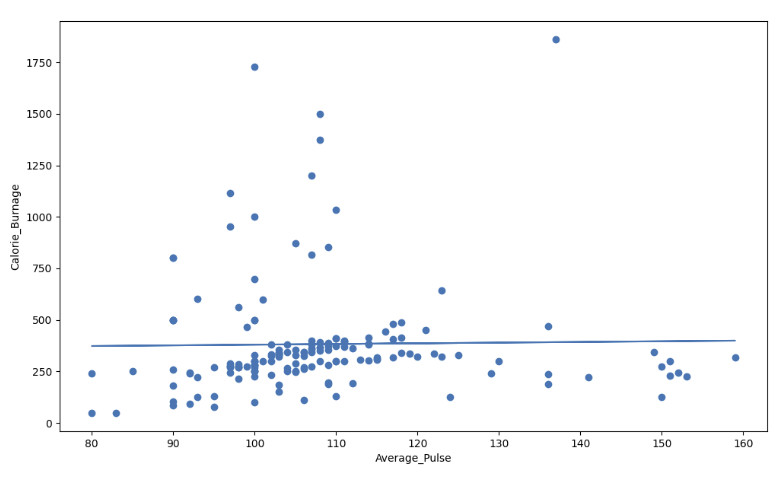
Visual Example of a Low R - Squared Value (0.00)
Our regression model shows a R-Squared value of zero, which means that the linear regression function line does not fit the data well.
This can be visualized when we plot the linear regression function through the data points of Average_Pulse and Calorie_Burnage.
Visual Example of a High R - Squared Value (0.79)
However, if we plot Duration and Calorie_Burnage, the R-Squared increases. Here, we see that the data points are close to the linear regression function line:
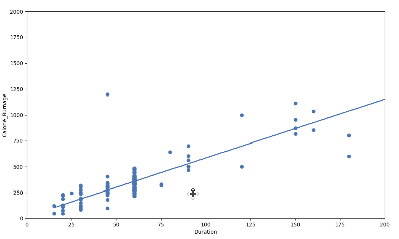
Here is the code in Python:
Example
import pandas as pd
import matplotlib.pyplot as plt
from scipy import stats
full_health_data = pd.read_csv("data.csv", header=0, sep=",")
x = full_health_data["Duration"]
y = full_health_data ["Calorie_Burnage"]
slope, intercept, r, p, std_err = stats.linregress(x, y)
def myfunc(x):
return slope * x + intercept
mymodel = list(map(myfunc, x))
print(mymodel)
plt.scatter(x, y)
plt.plot(x, mymodel)
plt.ylim(ymin=0, ymax=2000)
plt.xlim(xmin=0, xmax=200)
plt.xlabel("Duration")
plt.ylabel ("Calorie_Burnage")
plt.show()
Summary - Predicting Calorie_Burnage with Average_Pulse
How can we summarize the linear regression function with Average_Pulse as explanatory variable?
- Coefficient of 0.3296, which means that Average_Pulse has a very small effect on Calorie_Burnage.
- High P-value (0.824), which means that we cannot conclude a relationship between Average_Pulse and Calorie_Burnage.
- R-Squared value of 0, which means that the linear regression function line does not fit the data well.
.png)
Case: Use Duration + Average_Pulse to Predict Calorie_Burnage
Create a Linear Regression Table with Average_Pulse and Duration as Explanatory Variables:
Example
import pandas as pd
import statsmodels.formula.api as smf
full_health_data = pd.read_csv("data.csv", header=0, sep=",")
model = smf.ols('Calorie_Burnage ~ Average_Pulse + Duration', data = full_health_data)
results = model.fit()
print(results.summary())
Example Explained:
- Import the library statsmodels.formula.api as smf. Statsmodels is a statistical library in Python.
- Use the full_health_data set.
- Create a model based on Ordinary Least Squares with smf.ols(). Notice that the explanatory variable must be written first in the parenthesis. Use the full_health_data data set.
- By calling .fit(), you obtain the variable results. This holds a lot of information about the regression model.
- Call summary() to get the table with the results of linear regression.
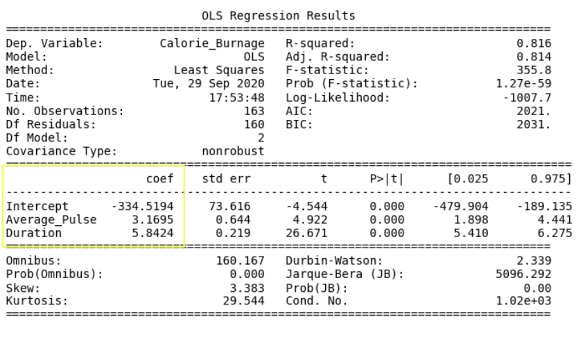
Output:

The linear regression function can be rewritten mathematically as:
Calorie_Burnage = Average_Pulse * 3.1695 + Duration * 5.8424 - 334.5194
Rounded to two decimals:
Calorie_Burnage = Average_Pulse * 3.17 + Duration * 5.84 - 334.52
Define the Linear Regression Function in Python
Define the linear regression function in Python to perform predictions.
What is Calorie_Burnage if:
- Average pulse is 110 and duration of the training session is 60 minutes?
- Average pulse is 140 and duration of the training session is 45 minutes?
- Average pulse is 175 and duration of the training session is 20 minutes?
Example
def Predict_Calorie_Burnage(Average_Pulse, Duration):
return(3.1695*Average_Pulse + 5.8434 * Duration - 334.5194)
print(Predict_Calorie_Burnage(110,60))
print(Predict_Calorie_Burnage(140,45))
print(Predict_Calorie_Burnage(175,20))
The Answers:
- Average pulse is 110 and duration of the training session is 60 minutes = 365 Calories
- Average pulse is 140 and duration of the training session is 45 minutes = 372 Calories
- Average pulse is 175 and duration of the training session is 20 minutes = 337 Calories
Access the Coefficients
Look at the coefficients:
- Calorie_Burnage increases with 3.17 if Average_Pulse increases by one.
- Calorie_Burnage increases with 5.84 if Duration increases by one.
Access the P-Value
Look at the P-value for each coefficient.
- P-value is 0.00 for Average_Pulse, Duration and the Intercept.
- The P-value is statistically significant for all of the variables, as it is less than 0.05.
So here we can conclude that Average_Pulse and Duration has a relationship with Calorie_Burnage.
Adjusted R-Squared
There is a problem with R-squared if we have more than one explanatory variable.
R-squared will almost always increase if we add more variables, and will never decrease.
This is because we are adding more data points around the linear regression function.
If we add random variables that does not affect Calorie_Burnage, we risk to falsely conclude that the linear regression function is a good fit. Adjusted R-squared adjusts for this problem.
It is therefore better to look at the adjusted R-squared value if we have more than one explanatory variable.
The Adjusted R-squared is 0.814.
The value of R-Squared is always between 0 to 1 (0% to 100%).
- A high R-Squared value means that many data points are close to the linear regression function line.
- A low R-Squared value means that the linear regression function line does not fit the data well.
Conclusion: The model fits the data point well!
Congratulations! You have now finished the final module of the data science library.

W3Schools Data Science Bootcamp
Python for Data Science Bootcamp
Learn with W3Schools.
Live online learning sessions.
Duration: 3 Weeks.
w3schools BOOTCAMP . 2023
In this mini bootcamp, you will learn how to use Python, which is one of the most powerful languages in the world of Data Science. The bootcamp covers important Python and Data Science libraries like Pandas, NumPy and SciPy, which you need to know to analyze and manipulate data. You will also be working through a Python application project.
You will learn Python for Data Science, Pandas, and NumPy over a 3 weeks period, with a live instructor and an interactive learning cohort.
You Will Learn
- Use Python for Data Science including cleaning, preparing and transforming data.
- Data visualisation with Matplotlib/ Seaborn
- Statistical analysis with Scipy
- Extensive use of the NumPy library
- Extensive use of the Pandas library
- Working with database connectors
- Working through an example python application project
3 Reasons to Join the Bootcamp
1. Live Online Instruction
Learn directly from experienced instructors through live online learning sessions.
2. Live Sessions
Learn three evenings per week between 7pm and 9pm, available in multiple time zones.
3. Affordable & Flexible
One of the most affordable instructor-led online bootcamps, with flexible payment options.
How it Works
1. Application and Enrollment:
Reserve your seat and enroll in the bootcamp by paying the bootcamp fee of only $495. The price includes the exam fee and 18 hours with live instructor.
2. Complete the Bootcamp:
After enrollment, you will be placed in a learning cohort with other students. You will go through the course material together and complete assignments and projects with the help of an experienced instructor.
The bootcamp covers Python for Data Science. The curriculum used is the , and .
Throughout the bootcamp, you will receive support from your cohort and the W3Schools team to help you grow your skill set.
3. Certification and Job Application:
Upon completing the bootcamp, you will get a Certificate of Completion for Python for Data Science and an extra acknowledgement that you were a part of the bootcamp. This certificate demonstrates that you completed the bootcamp and mastered the topics.

Login
|





.png)


.png)
